02 Explorations
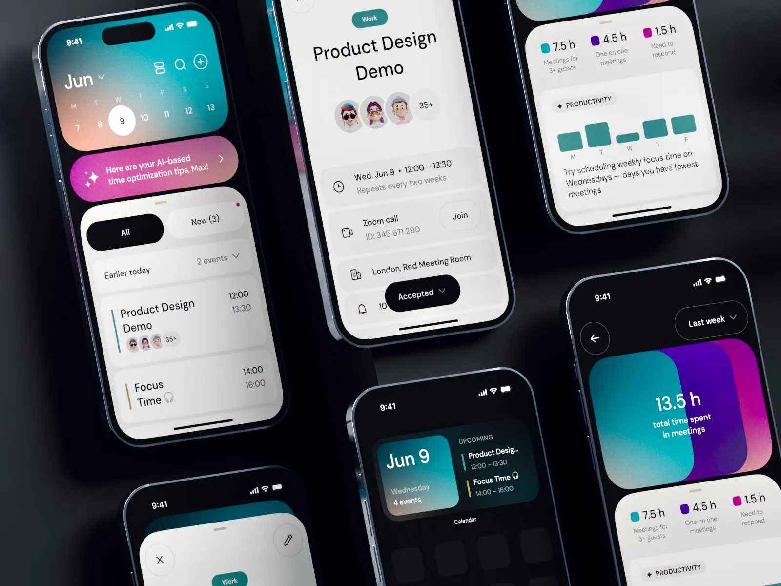
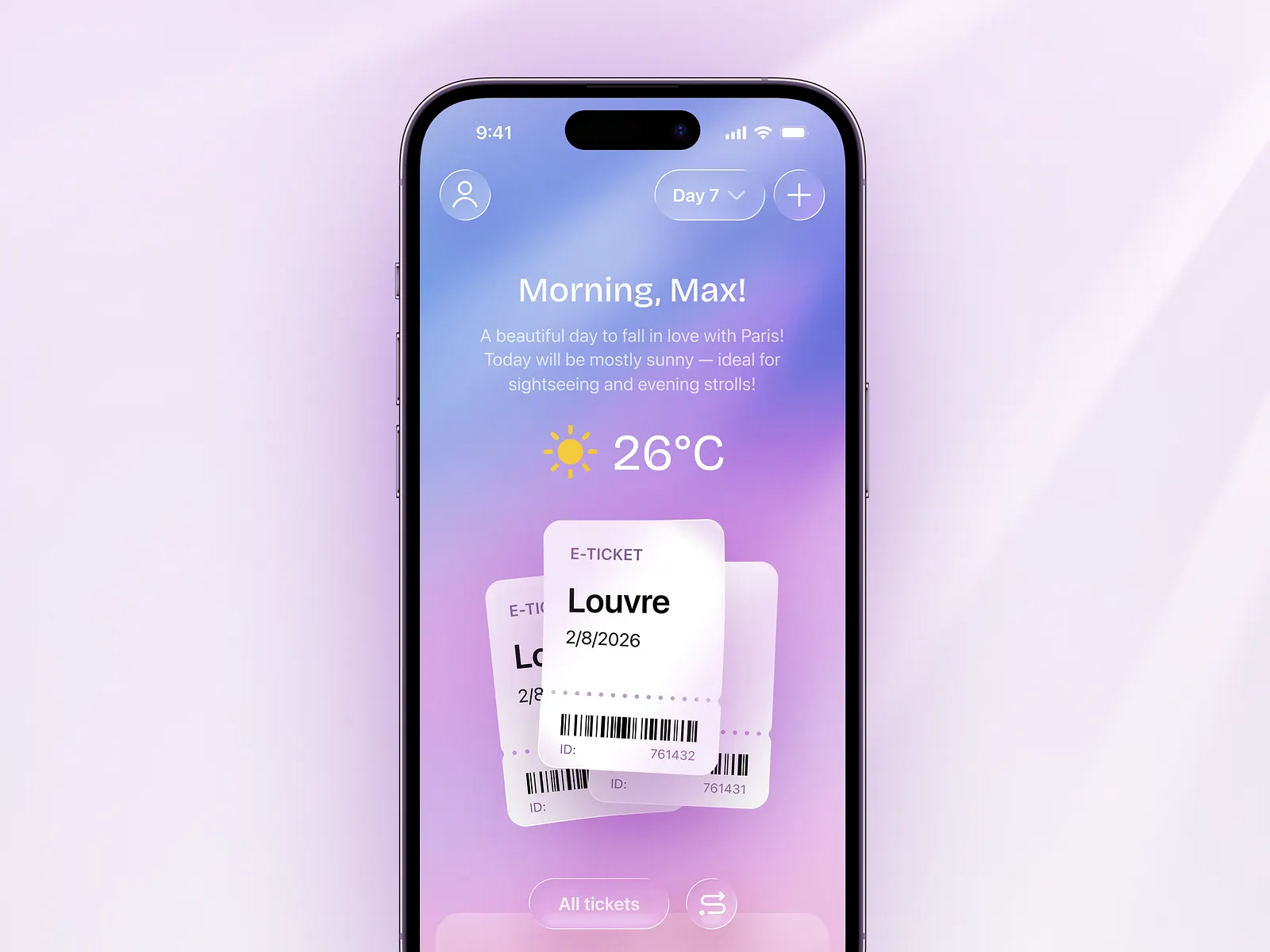
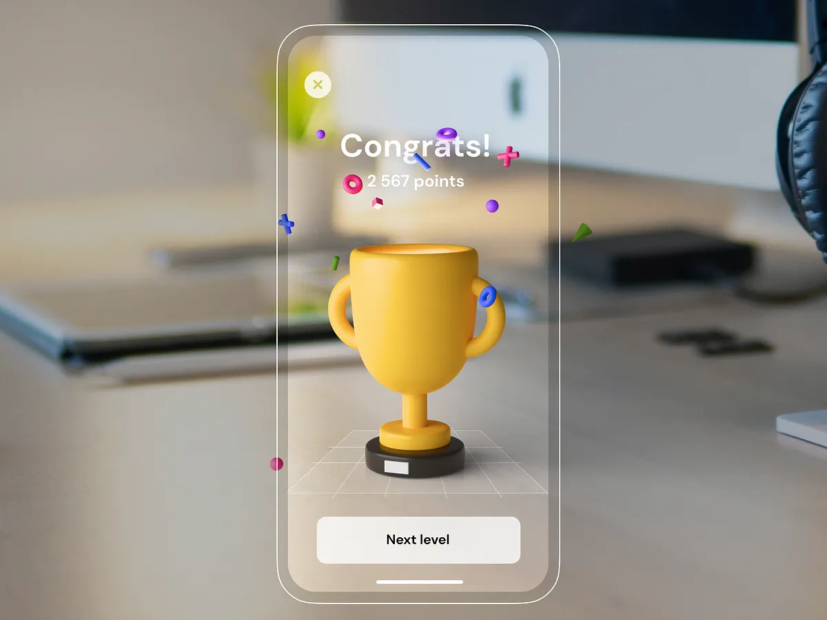
Exploring motion, animation, 3D, AR, UI concepts, and game development through personal projects and creative experiments. See more on Dribbble
London-based designer with over 15 years of experience crafting user-centered design solutions for web, mobile, and smartwatches. Currently working at Flo Health, driving gamification, wearable initiatives, symptom checker and logging, and other core experiences.
Exploring motion, animation, 3D, AR, UI concepts, and game development through personal projects and creative experiments. See more on Dribbble
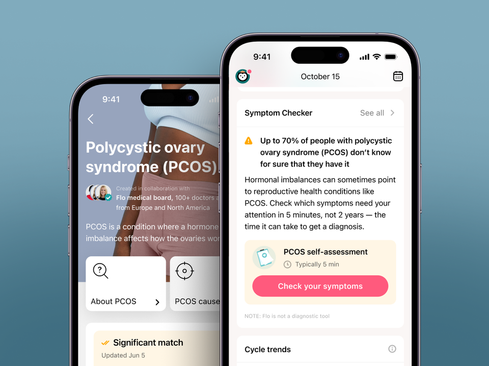
The Symptom Checker uses medical guidelines to review users’ health data to detect if there are the most common symptoms associated with reproductive health conditions such as PCOS, endometriosis, and more.
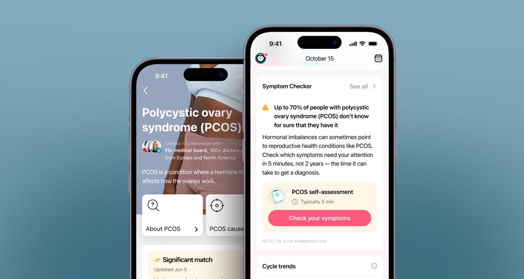
Flo is the #1 women’s health app worldwide. Over 300 million people around the globe use Flo as their ovulation and period tracker app, fertility calendar, and pregnancy assistant.
The project required close collaboration between various departments, including Product, Medical, Legal, Marketing, and Engineering. The Product team comprised a Product Designer (myself), Content Designer, Product Manager, and UX researcher.
Sexual and reproductive health conditions are common, but hard to diagnose. Endometriosis, uterine fibroids, and polycystic ovary syndrome (PCOS) impact a significant number of women and individuals who menstruate globally, with estimates ranging from 5% to 40% of reproductive-age women. Currently, it can take up to 12 years to diagnose these specific conditions, subsequently contributing to health complications and increased healthcare costs.

At Flo, we wanted to give women something they often lack: awareness. Symptom Checker highlights possible signs and patterns, empowering women to notice what matters and to make informed decisions about their health.
During the discovery phase, we explored the topic and created a simplified version of the feature as a proof of concept. This early version became our starting point for further design and research. The design process involved numerous iterations and user testing. Once we had a clear vision, we established priorities for iterative development and tested each increment internally. Finally, when we launched the first public version, we measured metrics and listened to user feedback (spoiler: the result was great!).
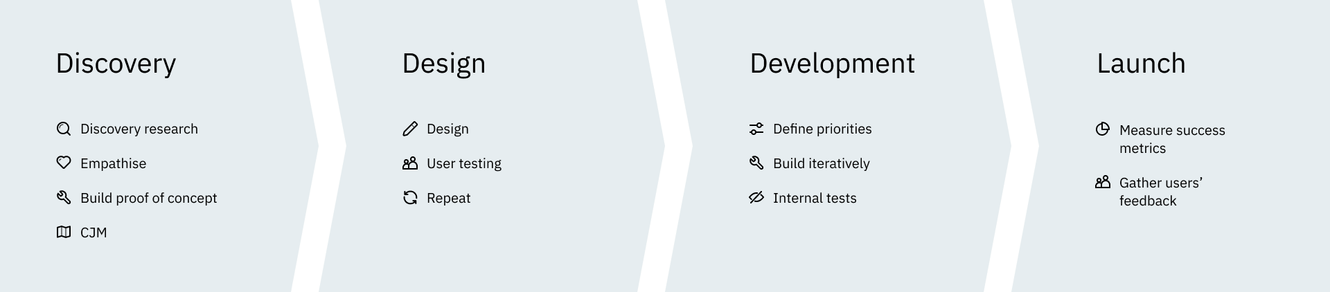
Such a project is not an easy thing to do, taking into account potential risks when it comes to people’s health. So while doing discovery research and diving deeper into the topic, we created a very simplified (and quite straightforward) first version of the Symptom Checker.
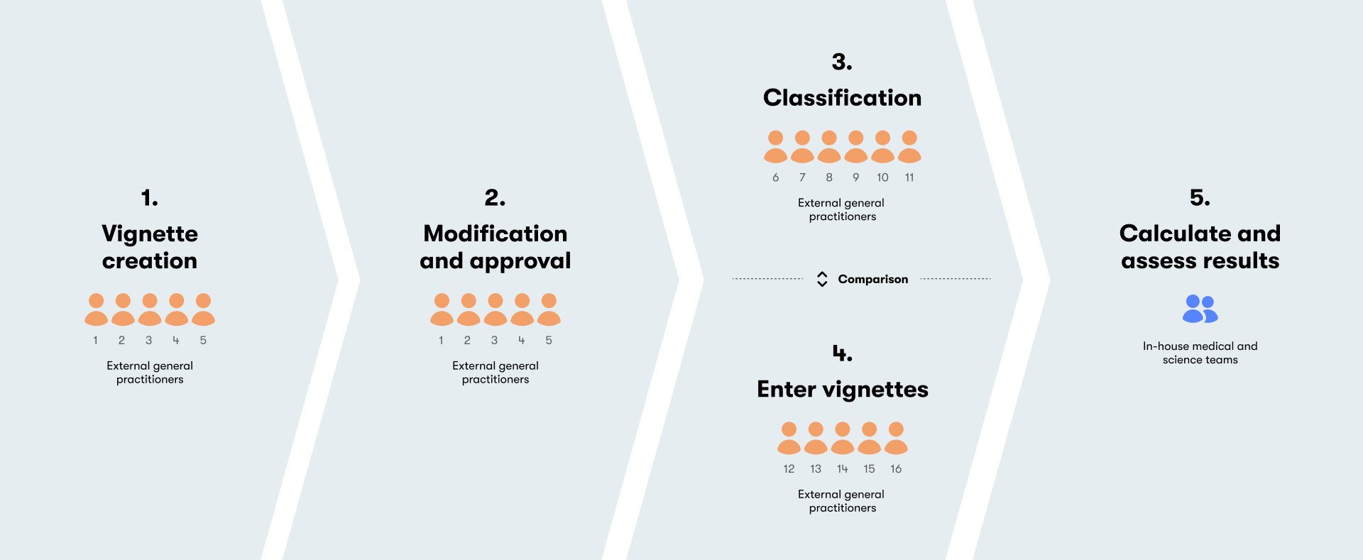
To make sure the Symptom Checker performed as intended, we validated the algorithm through an independent clinical vignette study, where general practitioners created and reviewed dozens of simulated patient cases before running them through the tool. The study was later peer-reviewed and published in JMIR mHealth and uHealth (2023).
The lesson was clear: by connecting the dots — combining symptoms, context, and clinical evidence — we could create a tool that highlights what matters, while keeping the responsibility of diagnosis where it belongs: with medical professionals.
Turning medical complexity into something users can easily understand and trust is never simple. For any product team working in health tech, this process raises a set of recurring challenges:
Based on the initial version, its user testing results, and findings from the discovery, we started mapping the user journey to find out opportunities for the best experience.
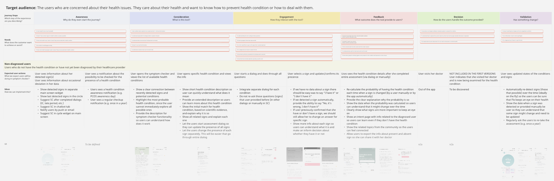
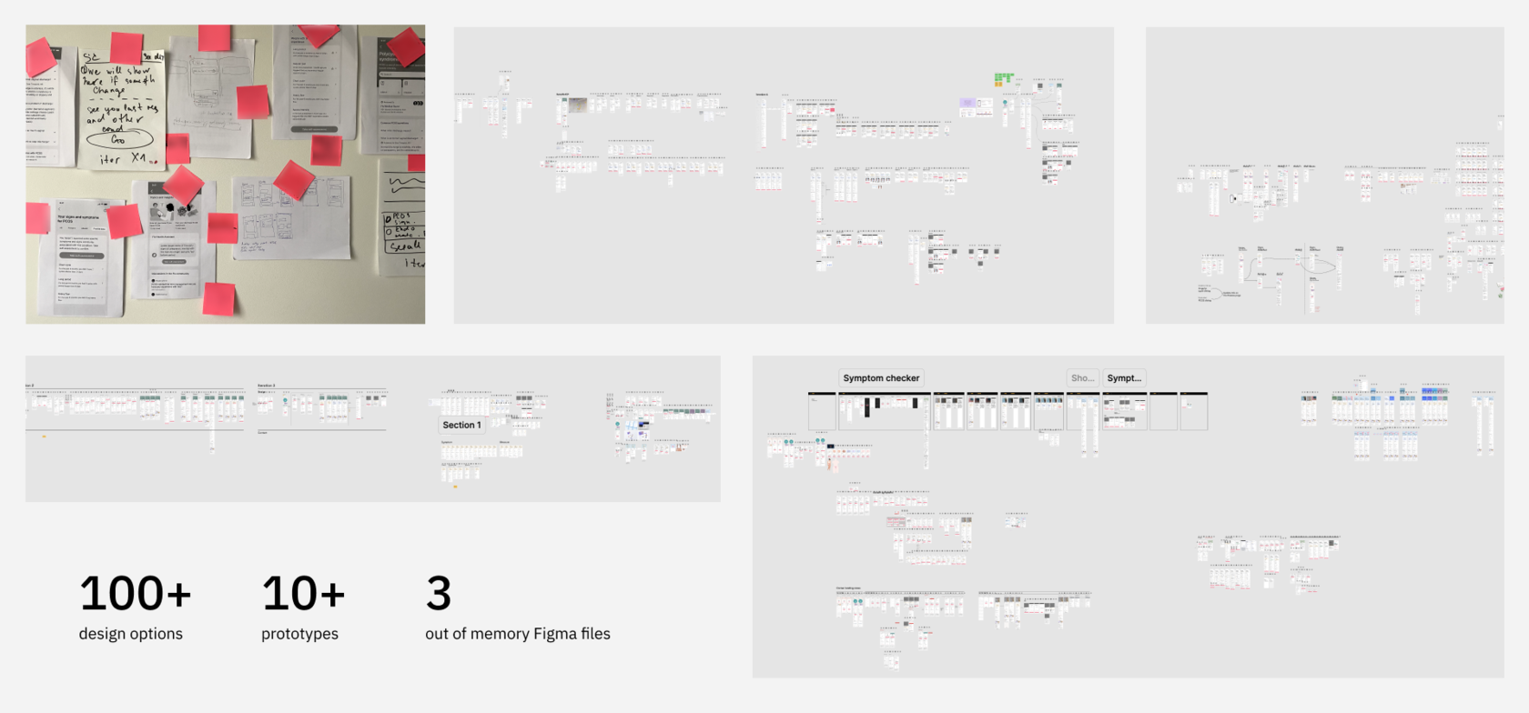
This step included an enormous number of ideas and design iterations for every single piece of experience: first touch and entry points, assessment and its results, symptoms list and statuses, user-needs-specific scenarios, and more. To make sure we were going the right way we were running user testing to validate our hypotheses and ideas.
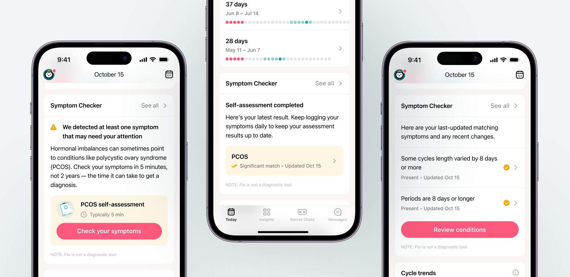
The Symptom Checker’s primary access point is the widget located on the Today screen. It acts as a crucial indicator of the current status, alerting users to potential issues by analyzing and interpreting the data they’ve submitted related to cycles and symptoms.
Some symptoms are critical while some are not. If the tone is too alarming, it can lead to stress or even avoidance. To strike a balance, we used visual hierarchy, highlighting the most important points, a supportive tone with language that is informative, calm, and encouraging rather than frightening, and provided context to ensure users understand that one sign doesn’t indicate a condition, but combinations may be worth noting.
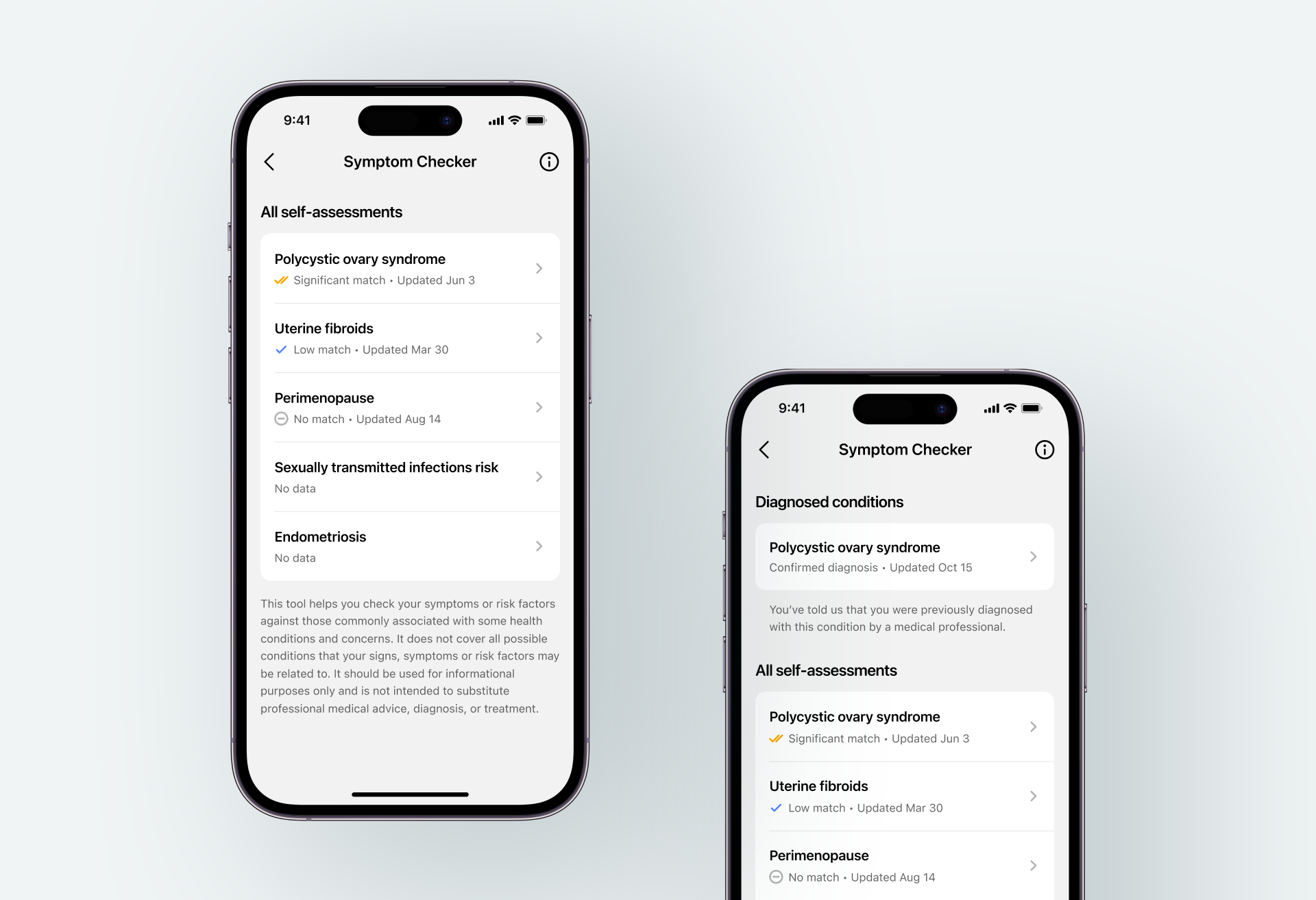
The initial version of the Symptom Checker emphasized clarity and transparency, presenting a direct list of assessments and diagnoses. This decisive design showcased the full features up front, building trust and empowering users from the start.
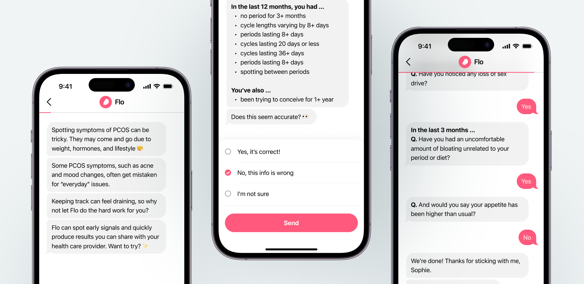
We built a chatbot that guides users through a simple conversational flow, collecting key details about their experiences and sending that information securely to our backend service for analysis.
Since recalling symptoms over the past year can be tough, we analyze users’ logged app data to detect unusual cycles or persistent symptoms. Combining these insights with self-reported information improves assessments and lessens reliance on memory.
Where possible, we added a signs and symptoms visualization so users can easily review their history, check for abnormalities, and verify accurate symptom detection.
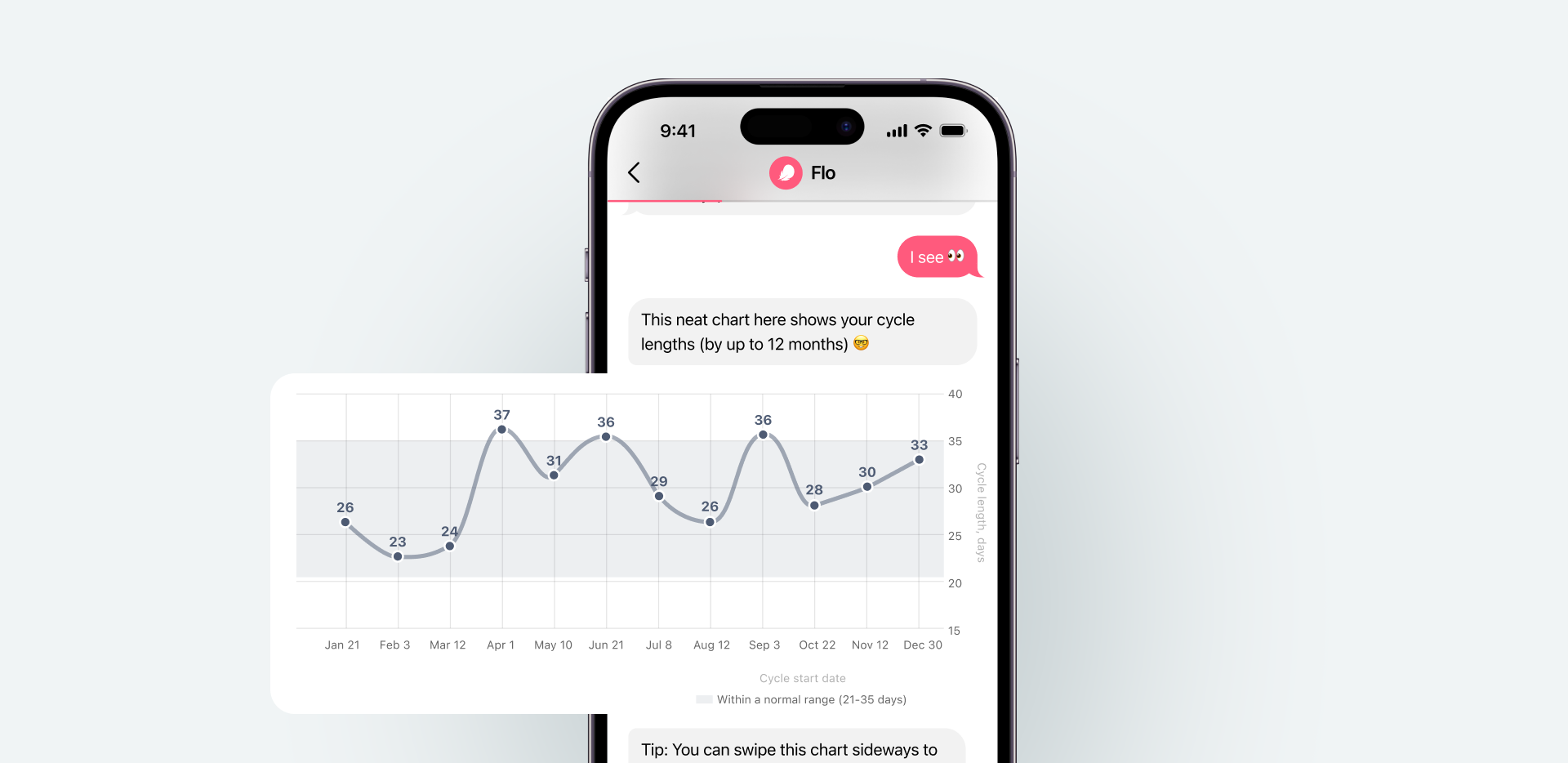
Once the information is gathered and analysed, the next challenge is deciding how to present it back to users. The goal was to highlight meaningful combinations of symptoms without creating unnecessary fear or implying a diagnosis.
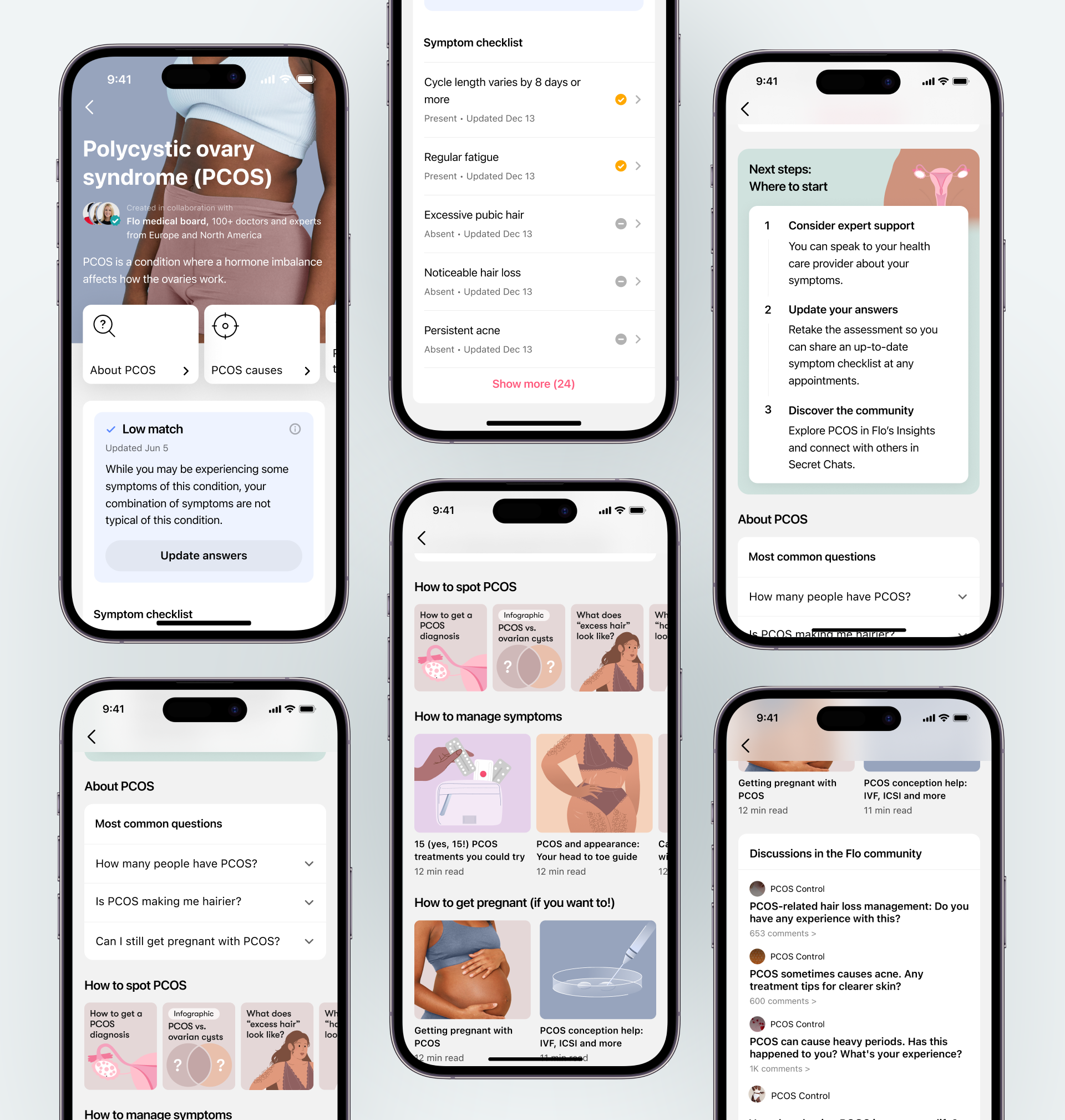
Together with this assessment’s result, the tool generates a symptoms checklist. It shows which of the user’s own signs overlap with those described in medical guidelines, making the reasoning behind the result transparent. The purpose of this design is simple: to give women something they can take to their doctor. The checklist is meant to support, not replace, the next medical conversation.
Summarizing, here users can read about conditions in detail (about, causes and treatment), see the symptom checklist, get education from the Flo library, and connect with others in the Flo community. All of these support users in their awareness, education, and social journeys.
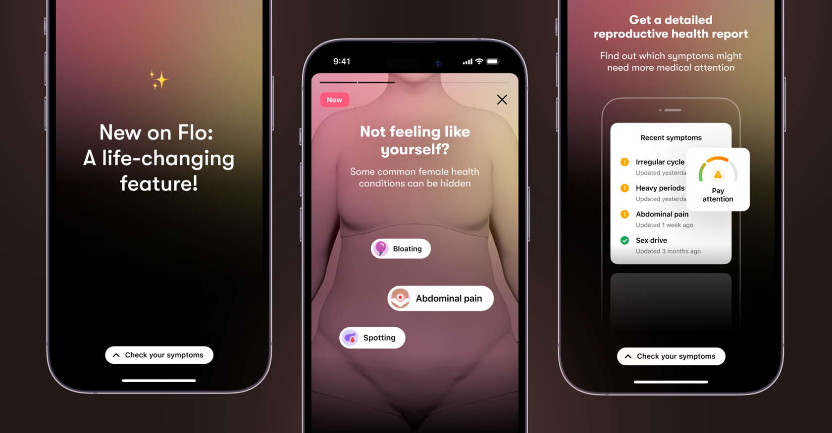
Finally, a promo story was designed to support the launch of the Symptom Checker. We tested several options of storytelling before finding the best way to catch users’ attention and explain the value.
Since its launch, the Symptom Checker has reached millions of people around the world (Flo’s Symptom Checker is not available in the United Kingdom, European Union, or European Economic Area.). For many, it was the first time they realized that their symptoms — the fatigue, the irregular cycles, the pain they had normalized for years — might be connected to an actual health condition.
Among them are at least 600,000 users living in countries with limited access to reliable health information, where the Symptom Checker is available free of charge as part of Flo’s Pass It On campaign. In regions where access to health care can be limited, this kind of information can be life-changing. Awareness becomes the first step toward care.
In our follow-up survey, 28,000 users reported that they spoke with their doctor after completing an assessment, 17,000 said they got tested for potential conditions, and 4,500 confirmed a diagnosis.
We’ve seen how knowledge itself can be empowering. For some, the assessment brought relief, a sense of understanding what had long felt uncertain. For others, it was the motivation they needed to finally talk to a doctor. Instead of searching the internet for answers or doubting their own experiences, they could walk into an appointment with clear, structured information about their symptoms.
The Symptom Checker isn’t just an algorithm. It’s also a carefully designed experience that respects both the sensitivity of women’s health and the responsibility of giving health-related information. Designing for healthcare isn’t like designing for any other product. Every detail carries weight.
2022 – 2023
Tracking body temperature in Flo adds valuable insight beyond period dates and symptoms, helping users better understand their cycles and make informed decisions about fertility and health.
Flo is the #1 women’s health app worldwide. Over 300 million people around the globe use Flo as their ovulation and period tracker app, fertility calendar, and pregnancy assistant.
As the lead designer for wearables at Flo, I managed the end-to-end user experience—from research and prototyping to information architecture and visual design—while collaborating with diverse stakeholders, including medical, legal, and compliance teams, to ensure all product standards and requirements were met.
The Product team comprised me, Content Designer, Product Manager, and UX researcher.
We began with discovery to identify user needs along with product, legal, and medical requirements. Through repeated testing and feedback, we refined our concepts and iterated on designs. This collaborative approach ensured alignment with developers during build and QA. After launching, we continued to monitor the product, collecting data to inform ongoing improvements.

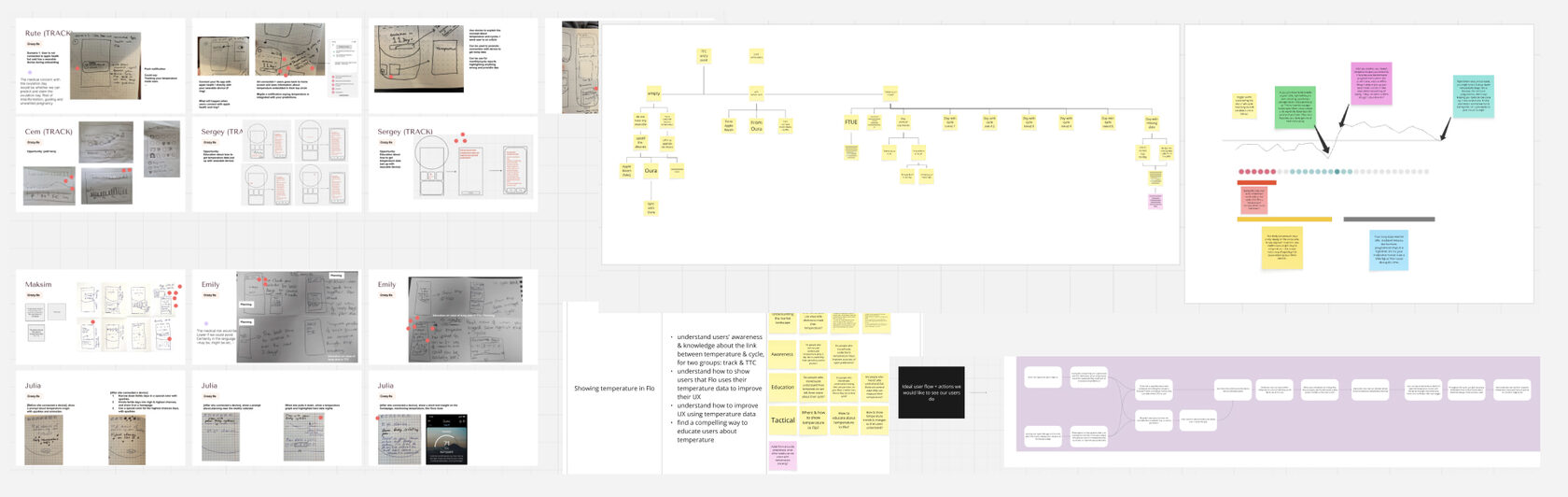
We started with a deep dive into the problem space through market analysis and user research to understand existing solutions and uncover unmet needs. Collaboration with the medical team ensured that our ideas aligned with clinical accuracy, safety, and regulatory requirements. From there, we held sketching and brainstorming sessions to explore multiple directions, mapping user flows and defining essential use cases. This foundation helped us identify key opportunities and set a clear vision for the product before moving into detailed design.
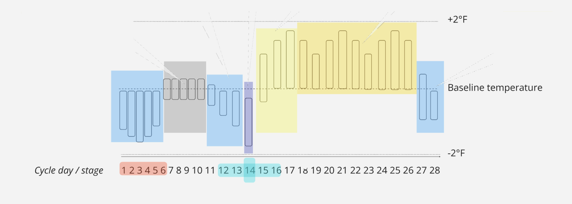
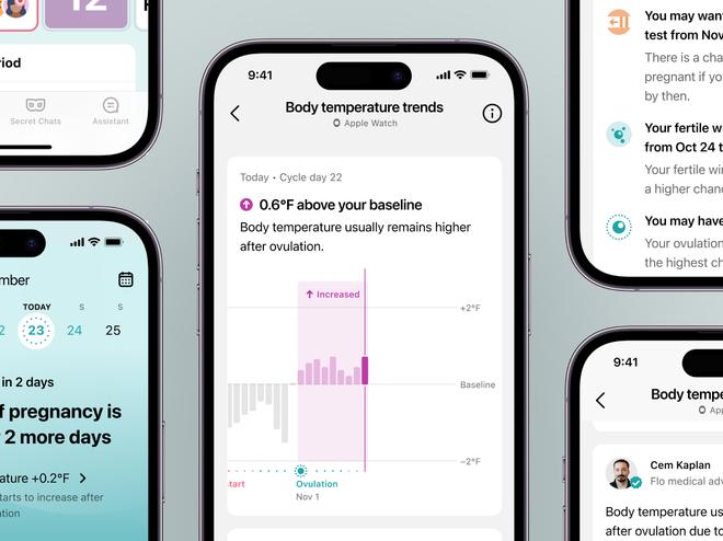
Body temperature naturally fluctuates throughout the menstrual cycle due to hormonal changes. Around ovulation, rising progesterone levels cause a slight increase in basal body temperature — typically by about 0.2–0.5 °C — which stays elevated until the next period begins. Tracking this subtle shift over time reveals recognizable patterns: a steady rise after ovulation, a plateau during the luteal phase, and a drop when the new cycle starts. These trends can help identify fertile windows, confirm ovulation, and provide insights into hormonal balance, offering a simple yet powerful view into reproductive health.
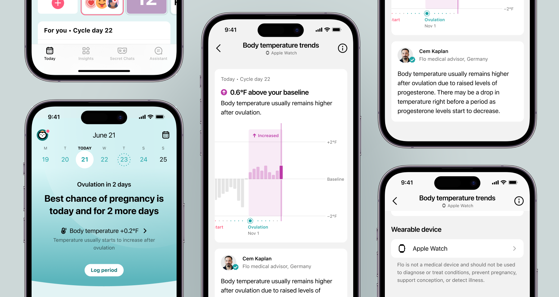
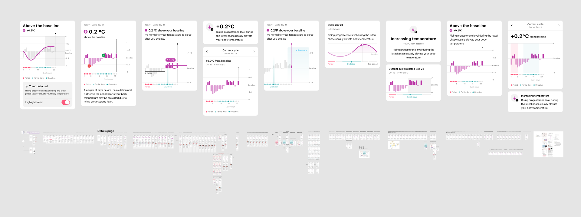
Based on the science of temperature changes and the principle of clarity, I explored hundreds of visual and interaction options to determine how best to communicate the story behind the data. The goal was to help users quickly grasp what matters most — how their temperature changes around key moments in the cycle, particularly ovulation and the period.
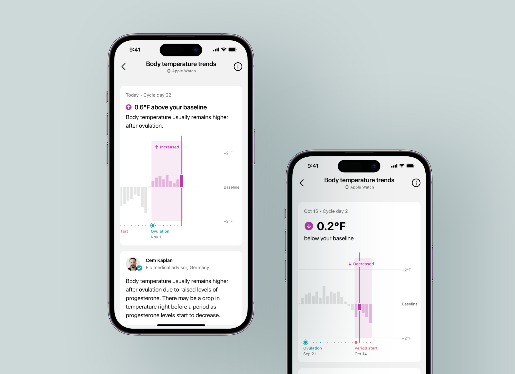
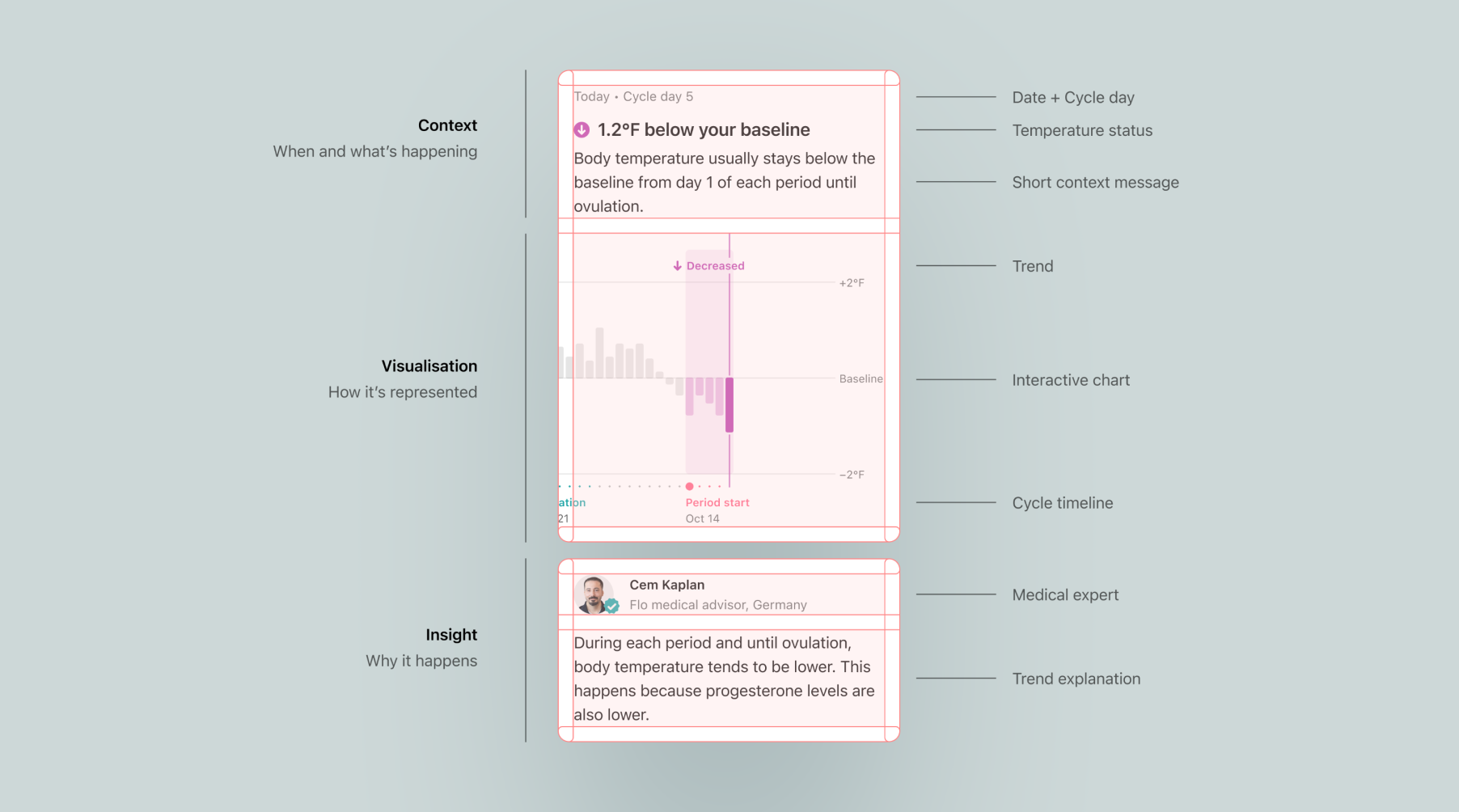
The final design focuses on giving users a clear picture of what’s happening in their cycle right now. The screen combines a temperature reading that shows whether it’s below or above the baseline, a short couple-line explanation to make sense of it, and a chart that visualizes the full cycle with the current trend highlighted. For those who want to learn more, a medical expert’s note expands on why these changes happen and what they mean for the body. Altogether, it turns complex temperature patterns into something easy to understand and relatable.
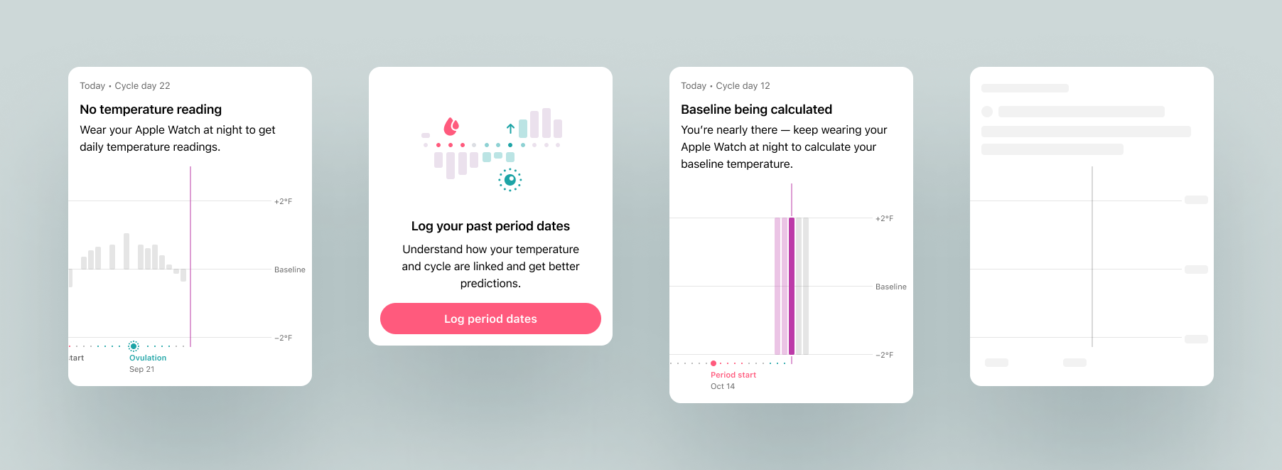
I also designed for moments when data isn’t fully available. A loading or skeleton state keeps the screen visually consistent while data is being fetched. When the baseline is still being calculated, users see a clear message explaining that more data is needed. If no cycles are logged yet or there’s no temperature data, the screen guides users on how to start tracking, keeping the experience informative and encouraging even without full insights.
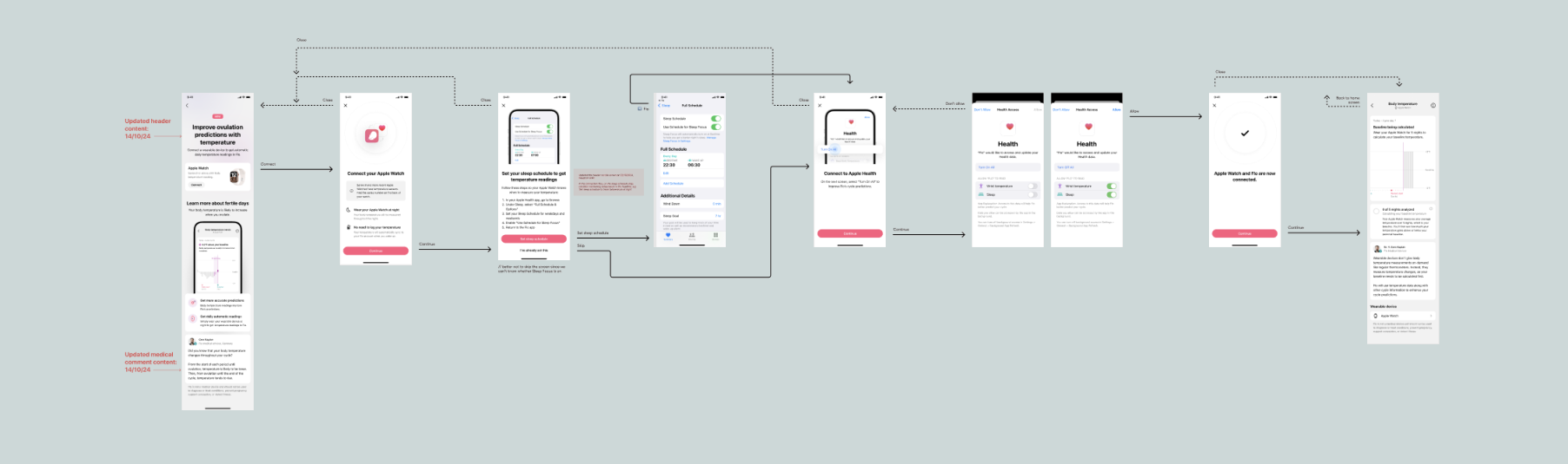
To make temperature tracking effortless, we designed a simple onboarding and connection flow that guides users through linking their wearable devices. The goal was to make the setup feel quick and reassuring — no tech hurdles, just a smooth start. During onboarding, users learn how temperature data fits into their cycle insights and what to expect next. We tested early prototypes with real users to identify where guidance or reassurance was needed most, then refined the flow to make each step clear and intuitive. The result is a confident, seamless start to a more connected and personalized experience.
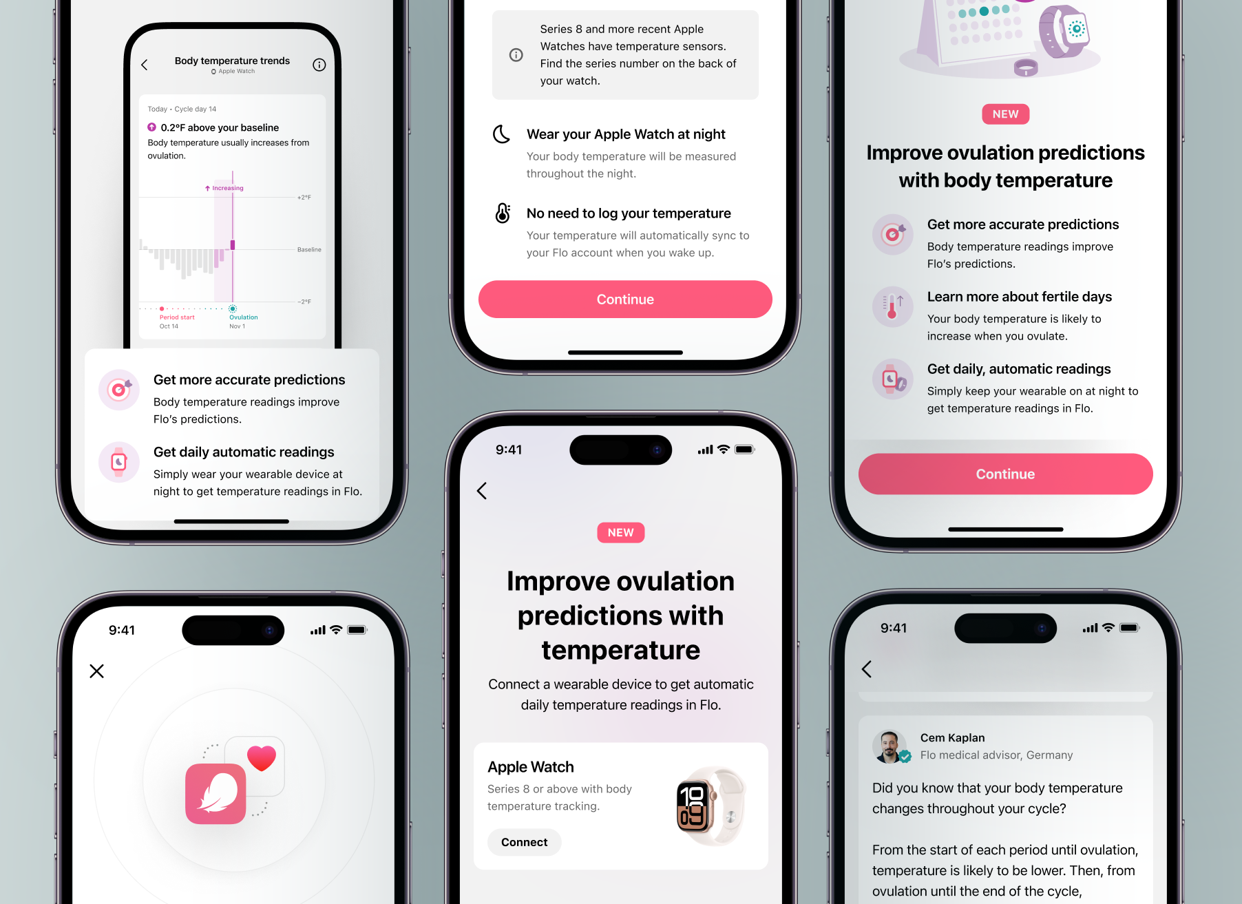
To help users understand the value of temperature tracking, we created a series of in-app stories that introduce the feature in a friendly, visual way. They explain how temperature connects to the menstrual cycle, highlight the benefits of syncing a wearable, and invite users to start tracking. Each story balances education and motivation — showing not just what the feature does, but why it matters.
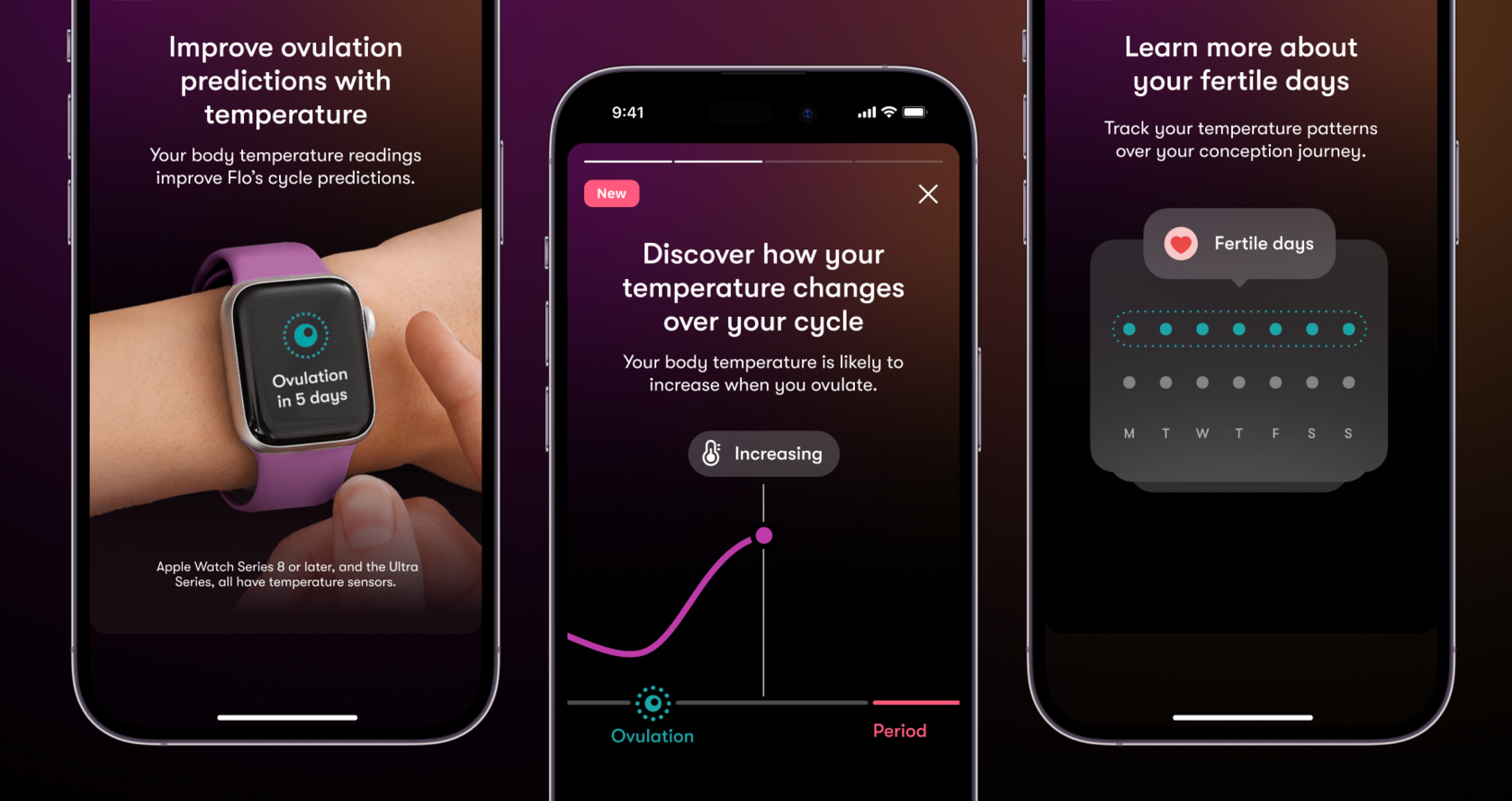
The new temperature tracking experience brought a noticeable improvement to the overall user journey. It made complex data easy to understand, helping users feel more confident and connected to their cycle. The feature met a growing market demand for deeper, science-based insights while staying true to Flo’s approachable tone. After launch, we saw positive signals confirming that the design improved both clarity and value perception across key product metrics.
This project showed me how important it is to make complex science clear and approachable. Working closely with users and medical experts helped turn subtle temperature data into something people can actually understand and trust. Small design choices — from the chart to the wearable connection — made a big difference in how confident and engaged users felt. It was a great reminder that combining real insights with user-centered thinking can create features that are both helpful and empowering.
2023 – 2024
Sleep tracking gives a broader view of health rather than just period and ovulation tracking. Sleep data adds context and may help users make lifestyle changes.
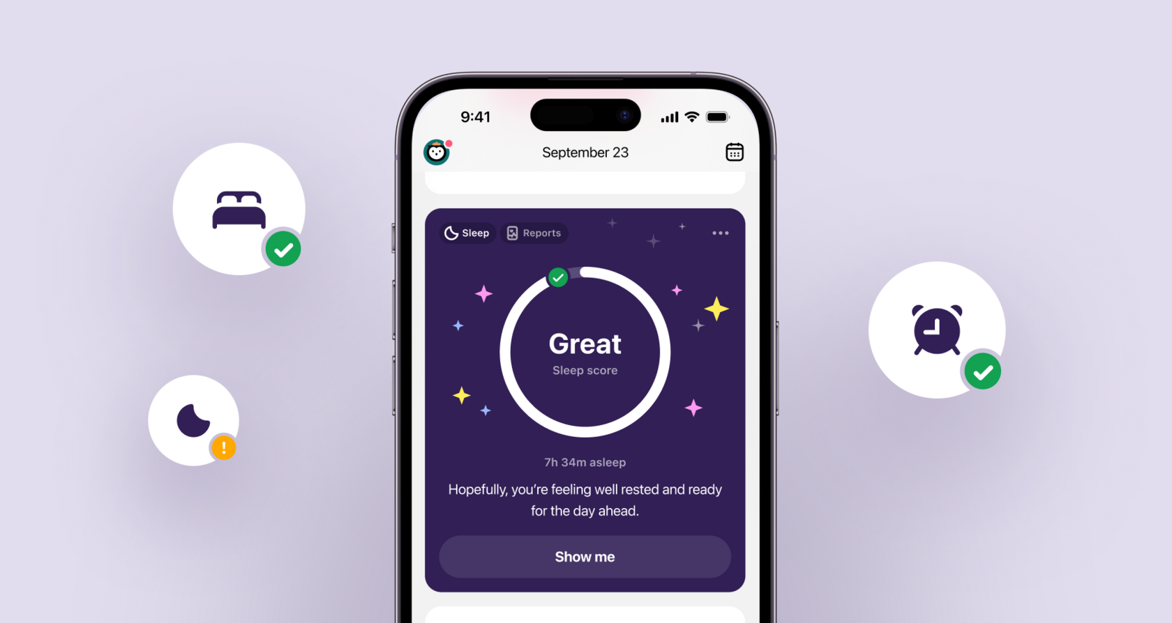
The Product team comprised me, another Product Designer I was mentoring, Content Designer, Product Manager, and UX researcher.
As the lead designer for wearables at Flo, I led the holistic user experience—from research and prototyping to information architecture and visual design—while collaborating with diverse stakeholders, including medical and legal teams.
Our approach followed a structured yet flexible process: first, we focused on understanding the problem space—diving deep into user needs, existing behaviors, and the broader sleep ecosystem to uncover key challenges and opportunities. Once we had a clear direction, we built a proof of concept to validate our assumptions and test the core experience early. From there, we entered an iterative cycle of design, feedback, and refinement—improving the UX with each round to ensure the solution felt seamless, valuable, and aligned with user expectations.

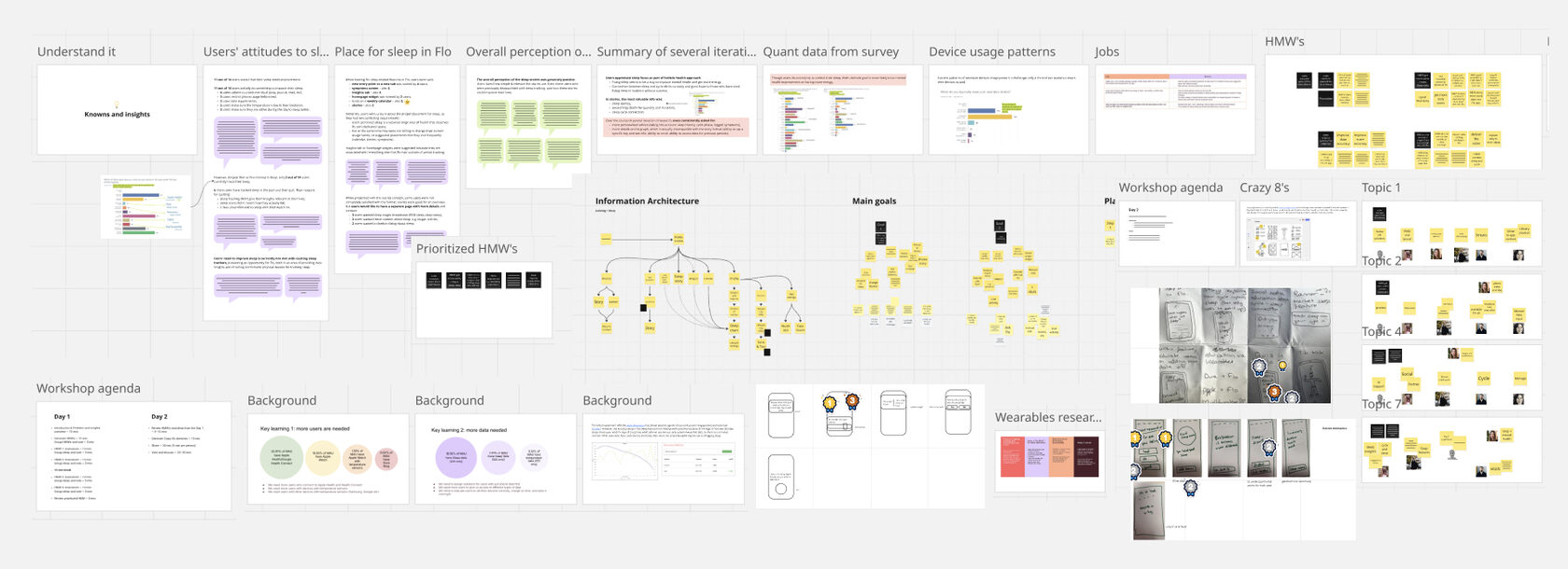
As usual, when stepping into a new problem space—in this case, sleep—it was important to start with a solid discovery phase. We needed to understand users’ existing behaviors, pain points, and motivations around tracking and improving their sleep. Once we had a clearer picture of the landscape, we moved into ideation—exploring a wide range of concepts that could make the sleep experience more engaging, useful, and personal. Through workshops and quick iterations, we refined these ideas into tangible directions that could later be tested and validated.
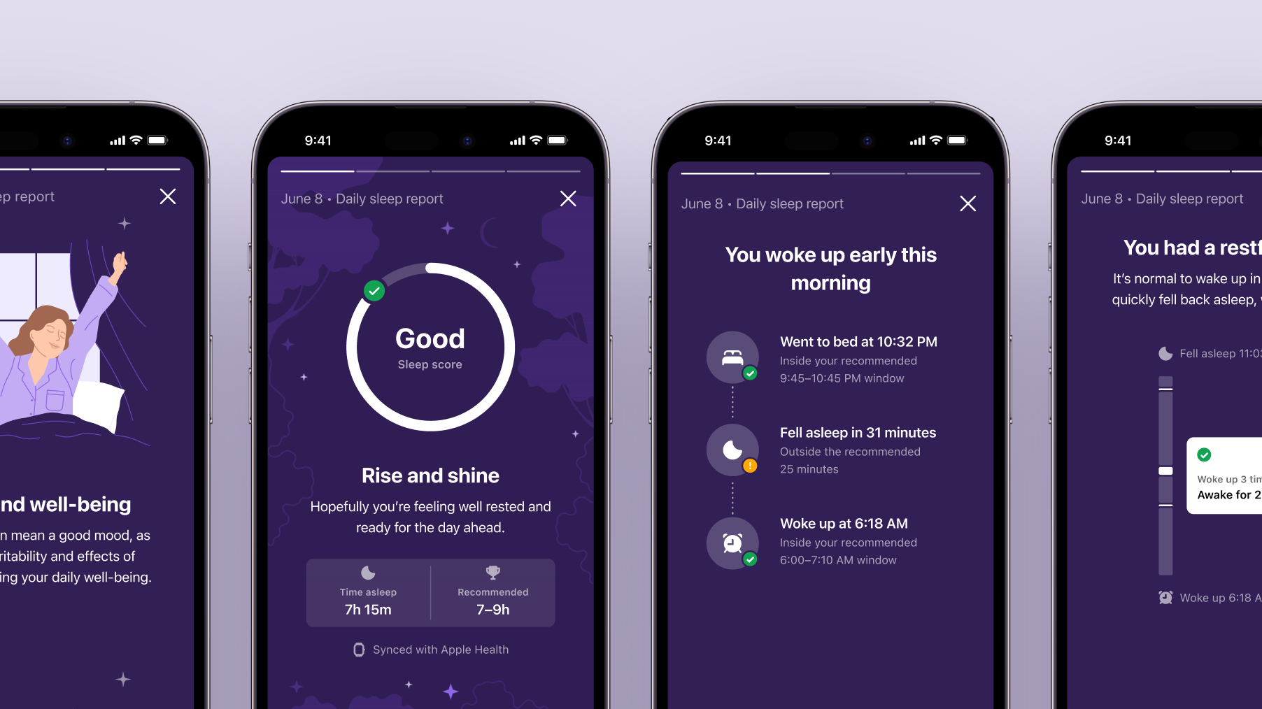
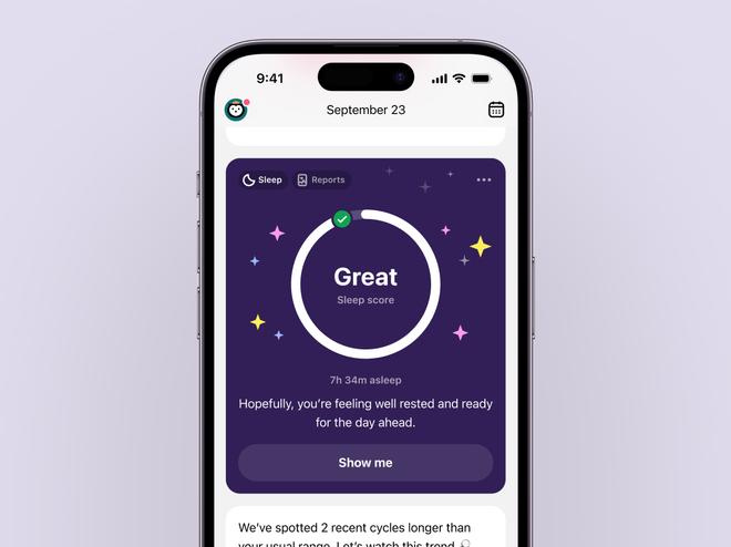
The first step focused on creating a daily sleep story—a narrative-style experience designed to help users better understand their sleep. Instead of showing raw graphs or metrics, we turned the data into a clear, human story split into four simple parts:
This phase directly addressed core user needs: ensuring they get enough restful sleep to feel energized, understanding the factors that influence their sleep, and recognizing what might be disrupting it. By making sleep insights feel more personal and approachable, the daily story encouraged reflection and gradual improvement in sleep habits.
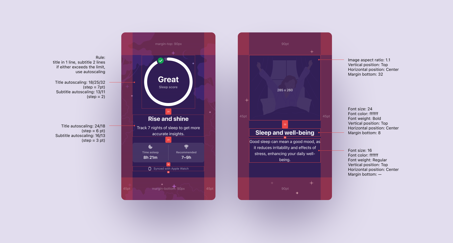
Once the daily sleep story was in place and proving valuable, the next challenge was to expand the experience so it could reach more users, feel relevant from day one, and become a natural part of the product ecosystem. This meant shifting from a single core insight toward a more accessible and flexible sleep system. The focus moved to accessibility and reach (like adding phone-based tracking), supporting users even without long-term data, and making sleep insights more visible and personal through the homescreen feed. In other words, evolving from a feature you open into a feature that meets you where you are.
To unlock sleep insights for more users, we introduced phone-based sleep tracking—a major step in making the experience more accessible. Instead of requiring a wearable, users could now rely on their phone’s sensors to track sleep. This not only lowered the barrier to entry but also significantly expanded the active user base. From a product perspective, it turned sleep insights into something instantly available, helping users experience the value sooner, while also supporting business growth through a wider funnel and better feature adoption.
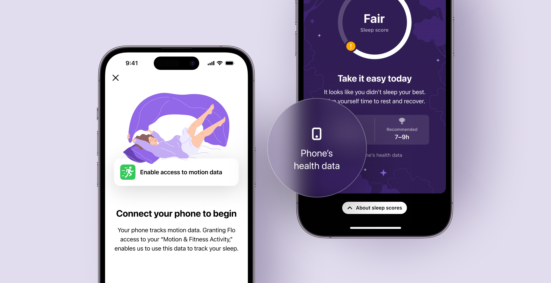
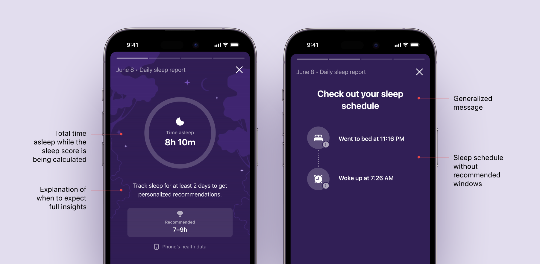
To support sleep insights from day one, we had to rethink how quickly value could be delivered. One key step was optimizing the sleep score algorithm so it required just two nights of data instead of seven. We applied the same principle to the sleep schedule recommendations. For users with less than two days of sleep data, we designed a lightweight version of the story—one that still shows time asleep, awakening patterns, and useful context, even if the score and schedule recommendations aren’t ready yet. This allowed us to keep users engaged from the start and build trust while the system learned their patterns.
To make sleep insights feel more present and meaningful in users’ daily routines, we introduced a dedicated sleep card in the homescreen feed. This shift aligned directly with key jobs-to-be-done—helping users stay aware of their sleep quality, understand what affects it, and feel more in control of their overall well-being.
The impact was immediate. This sleep card became the best-performing card in the feed. It proved that when insights are timely, relevant, and easy to access, users feel more connected and motivated to act.
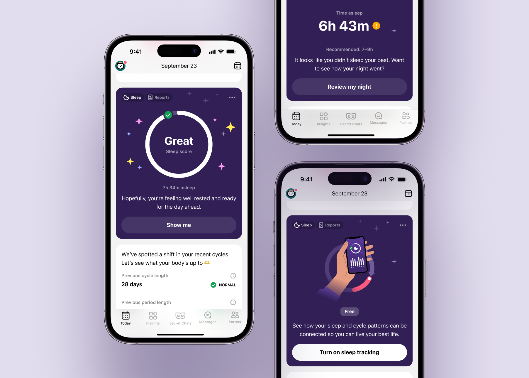
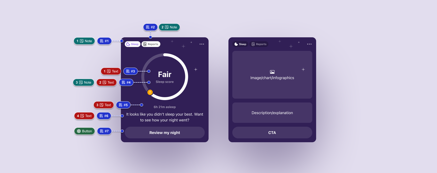
The daily sleep story helped users understand their sleep in a clear, human way, while the homescreen sleep card reinforced those insights throughout their day. By introducing phone-based tracking, we made sleep insights available to a much wider audience—removing the wearable barrier and expanding the feature’s reach. Optimizing our algorithms allowed users to access sleep scores and deeper insights sooner, increasing early engagement and trust. Altogether, these changes led to stronger retention and deeper user connection to their health data.
This project reminded me that great UX is more about timing and making things accessible than depth alone. Working for users with all kinds of data—some, none, or just a bit—made us really focus on what’s clear and helpful. Simple tweaks, like faster insights or showing users what they need right away, made a big difference.
2024 – 2025
Flo is the #1 women’s health app worldwide. And the app for Wear OS (powered by Google) is a great extension to the experience of users with Android smartwatches.
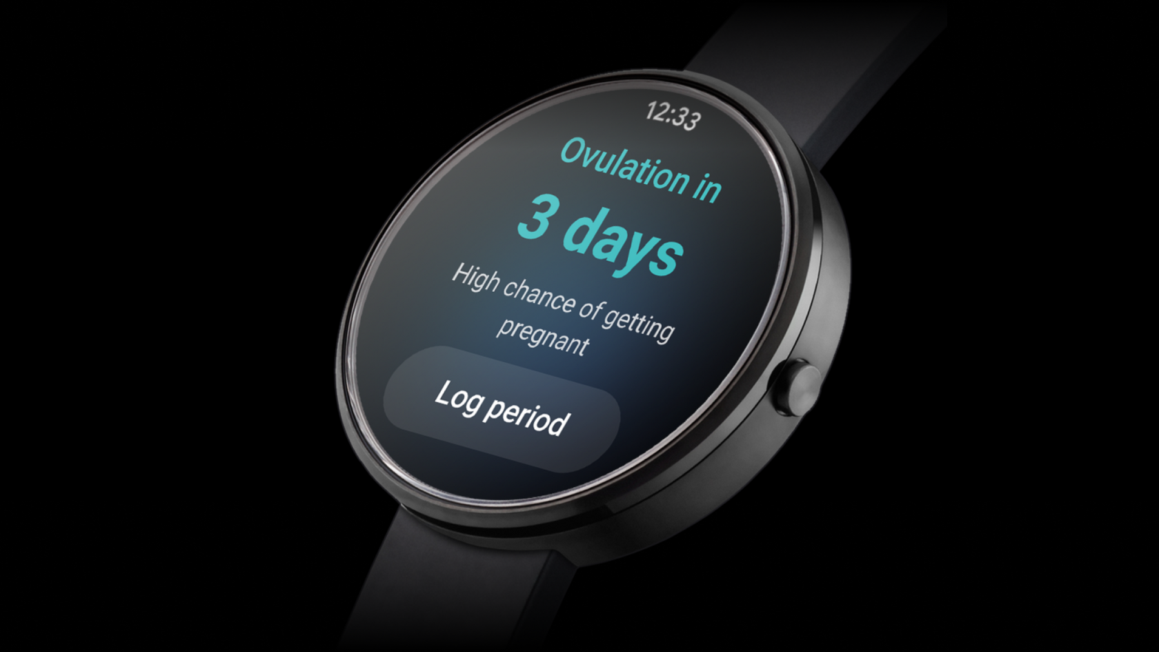
The Flo companion watch app was unavailable for Android smartphones for a significant period. When we began its design and development, starting from scratch became essential. The existing Apple Watch app was outdated and no longer aligned with the evolved core mobile app, which had gained many new features and benefited from user feedback. Therefore, we decided to begin anew.
Our main goal was to design and launch the Flo app for Wear OS 3.0, supporting core user modes and goals. This sought to close user experience gaps by utilizing the most popular touchpoints and improving accessibility across the platform.
There was a team of three on the project: me as a Product Designer, Product Manager and UX researcher.
The work on the project was based on the Double Diamond approach starting with the Discovery phase to understand existing users’ behaviour, needs, and problems, going through ideation, scenarios and users’ jobs mapping, to user testing and finalizing design for development.
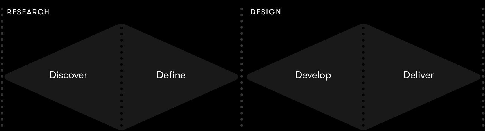
During this phase, we kicked off the project with the Feature canvas, conducted user research to understand an experience around wearable devices, mapped core user jobs for existing Flo users, and ideated on possible solutions.
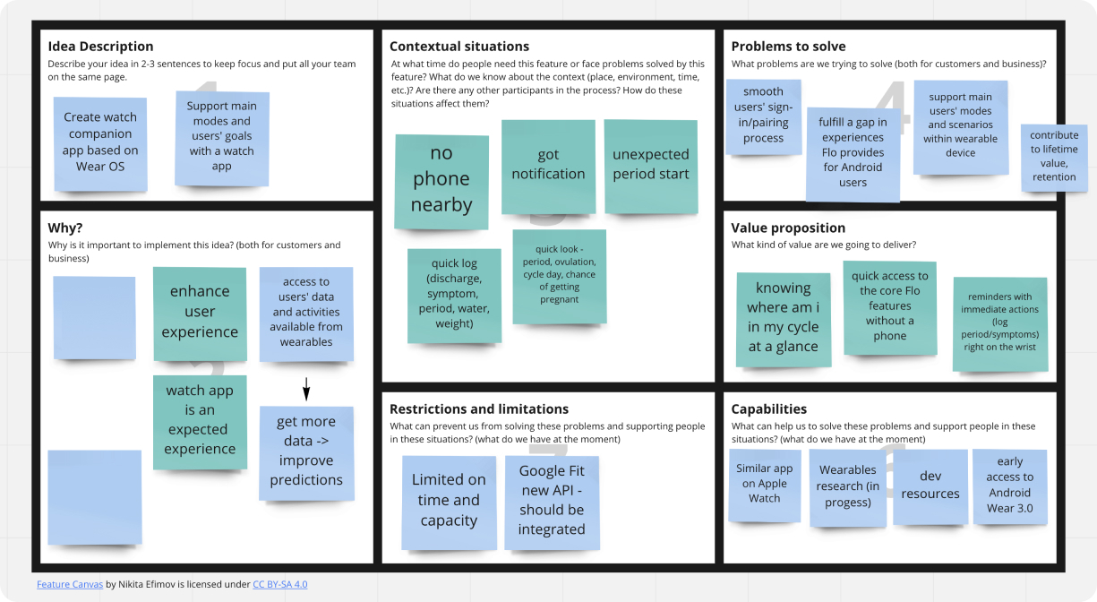
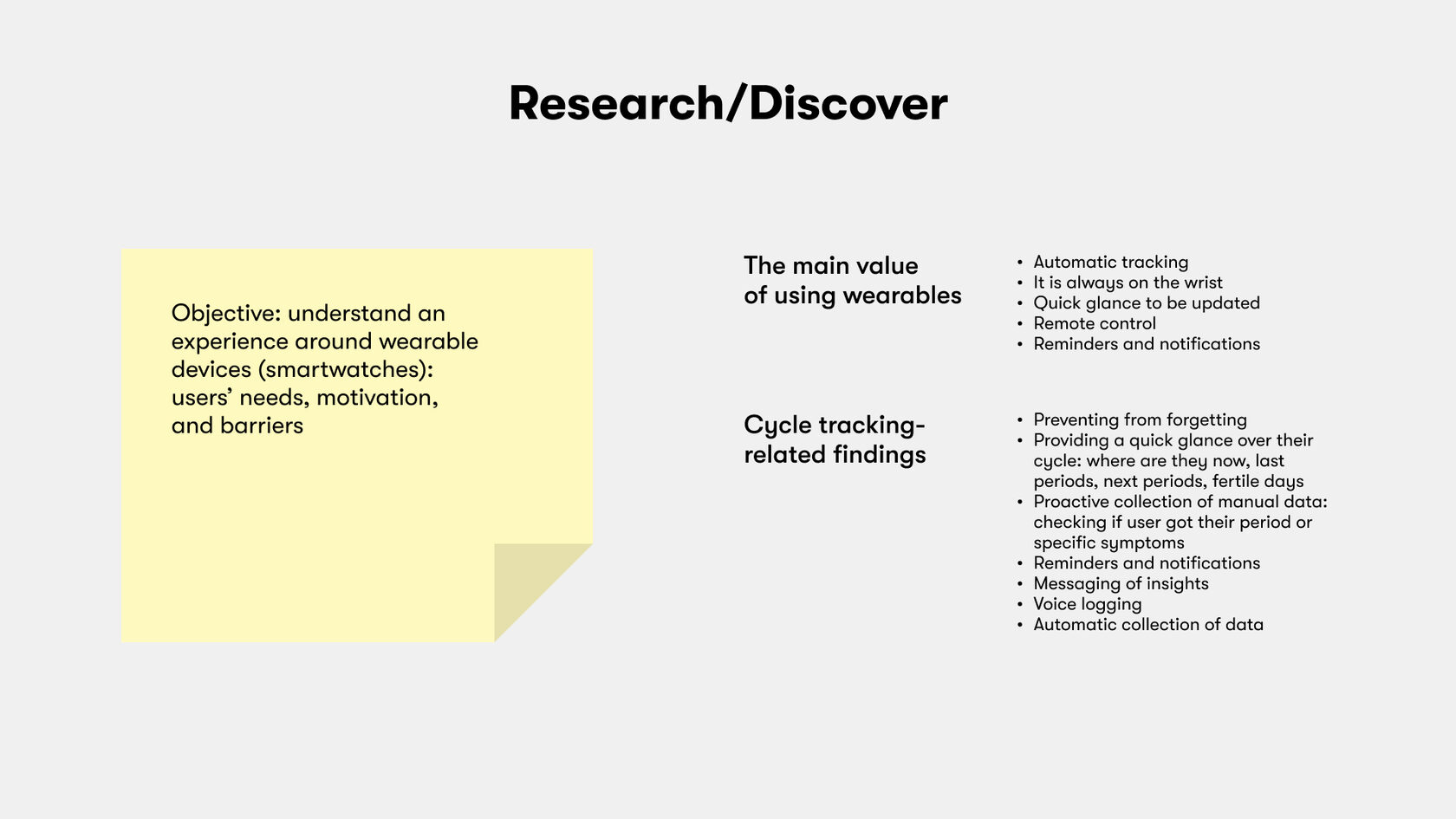
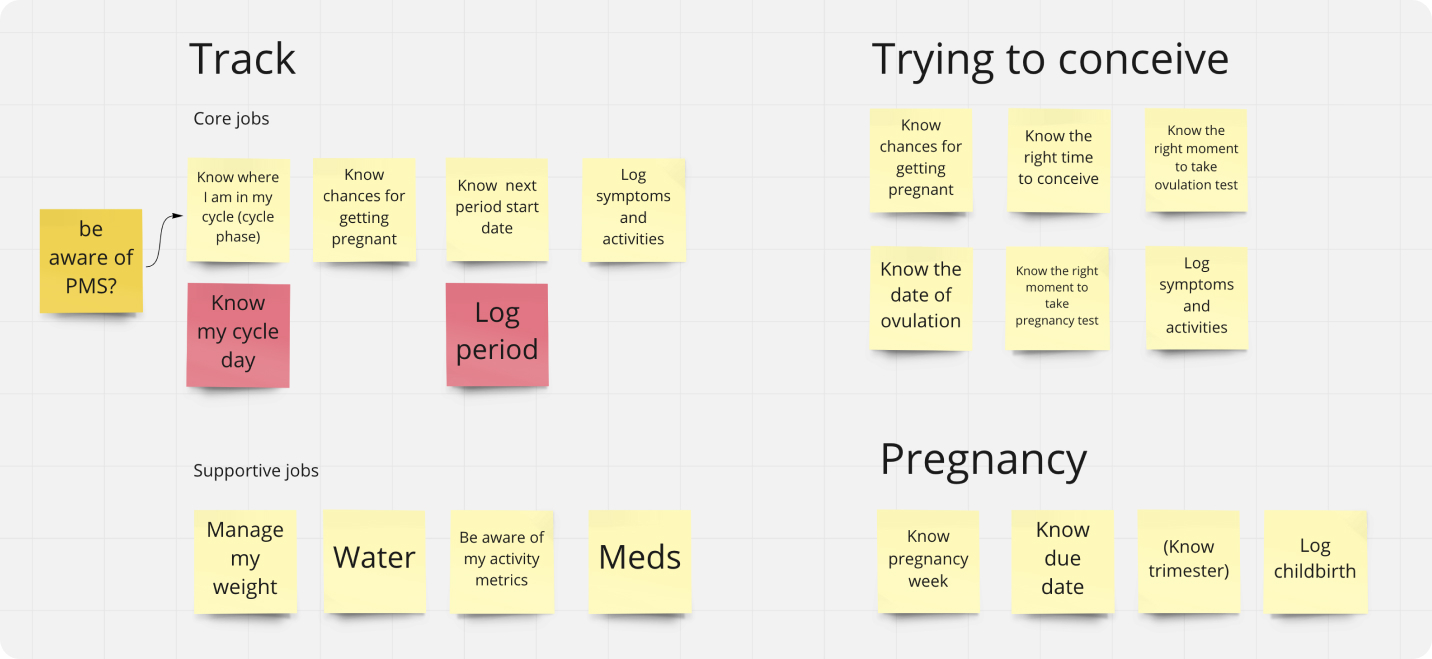
At this stage, we deep-dived into existing Information Architecture principles for Wear OS, and mapped key user scenarios based on that.
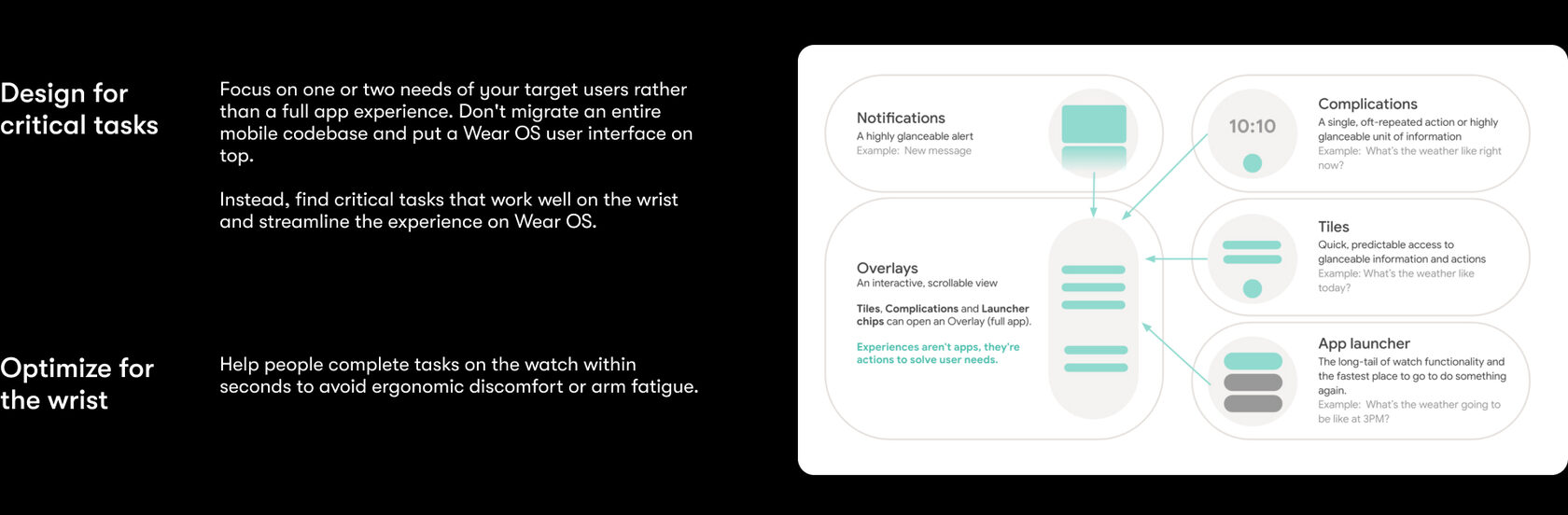
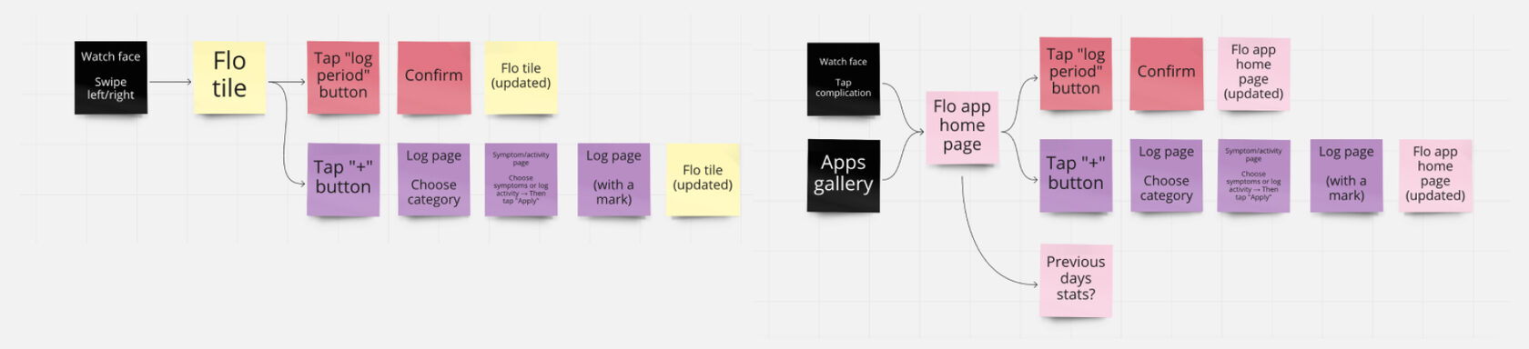
Finally, it’s time to build and test the prototype. We had three main goals for the upcoming user testing:
Fun fact: when we were creating this prototype, there were no convenient ways to test the design inside the smartwatch, so we decided to test it as a regular mobile app. And that worked well!
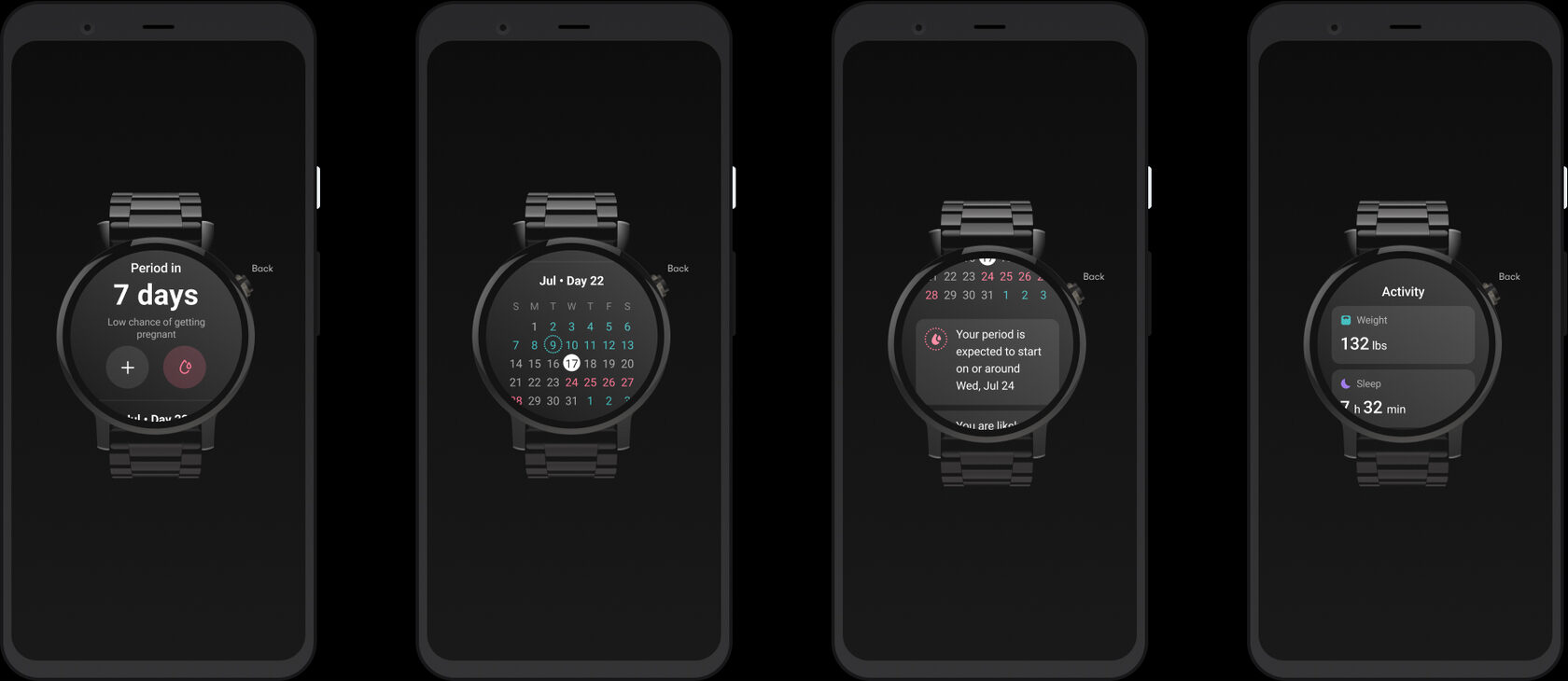
The overall impression of the layout is great; there is no evidence of any significant barriers to using it as it is, but several UX issues hinder the experience.
After prioritization activities (considering users’ feedback, time, value, and effort), we devised a structure for the first release that covers the most significant and easy-to-build features.
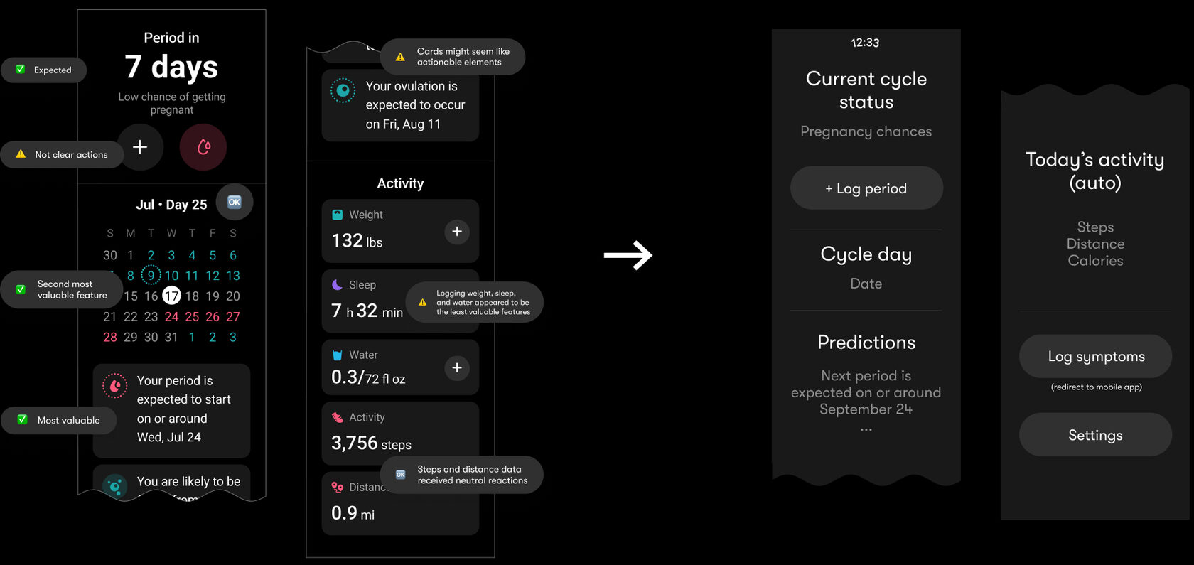
Since the Wear OS is powered by Google, it’s compatible with the Android ecosystem. With some minor tweaks, that allowed us to reuse components and styles from the existing Design System used on mobile devices. The only essential difference was in using dark mode styles only because of watch design guidelines.

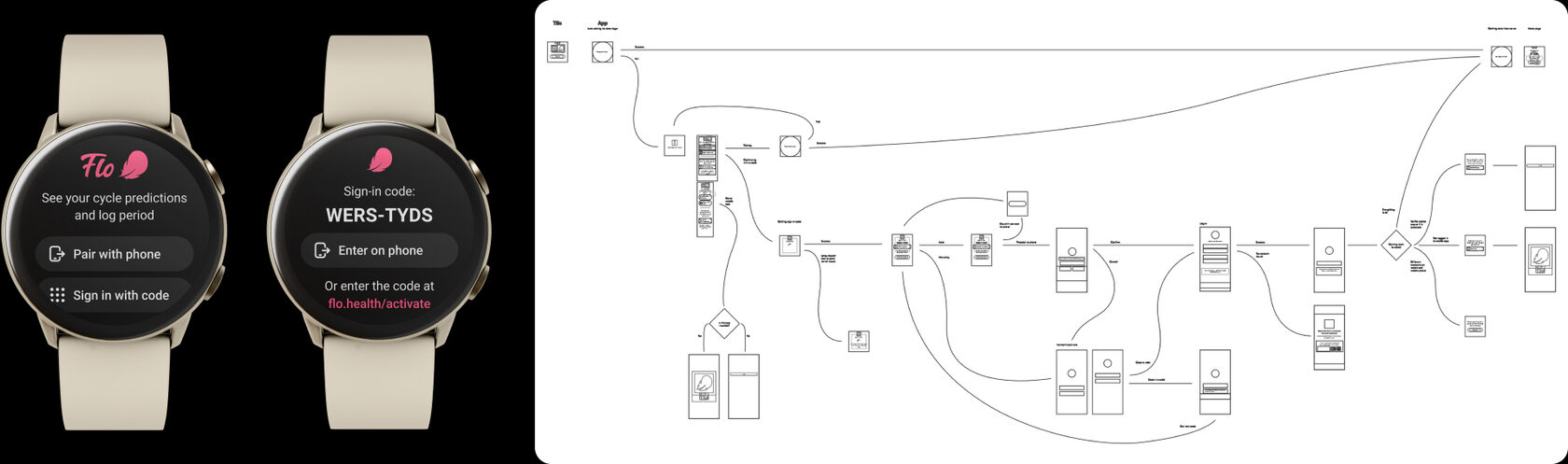
The main challenge was that Android smartwatches represent a different client from a technical standpoint. So we had to consider all possible ways to sign in to make the flow as smooth as possible. As a result, we designed a flow that covers cases from auto-pairing to backup pairings via sign-in code and others.
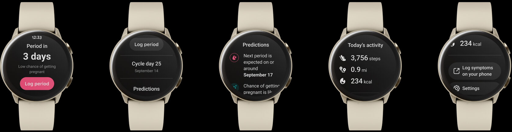
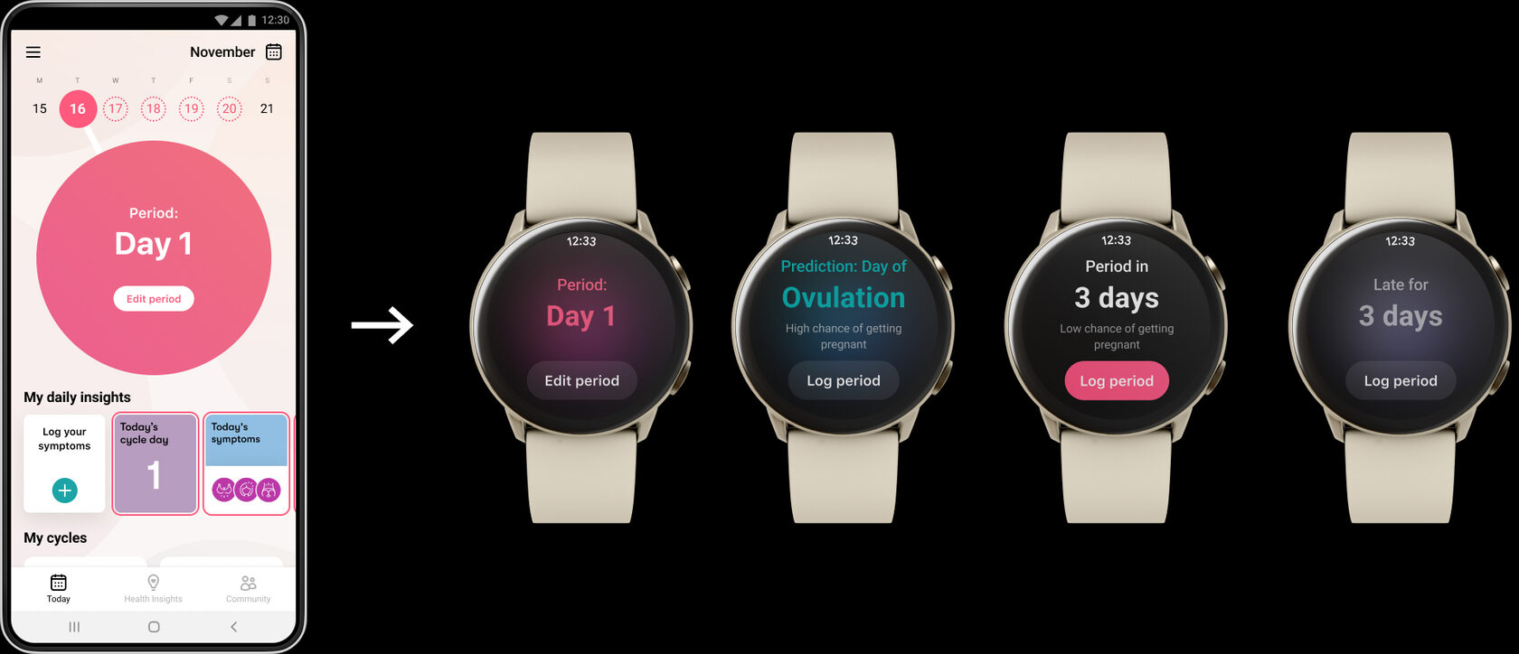
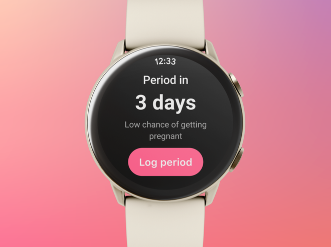
The circle in Flo is the main part of an overall experience which provides glanceable info on where users are in their menstrual cycle. It was essential to preserve the circle’s states and bring a similar experience to the watch.
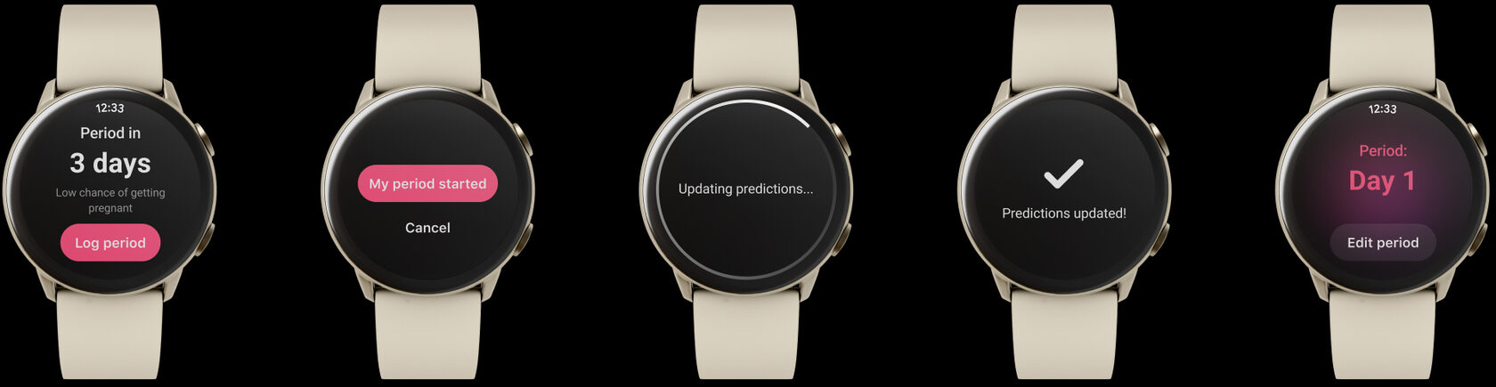
The logging period is an essential functionality for the Flo experience. For the watch app, we designed the feature according to the watch IA principles and key user scenario: I’m using a smartwatch as a quick way to log what’s happening to me at the moment. That means the watch user can log a period only for today. Logging for the past appeared to be more “nice-to-have” than “must-have” functionality.
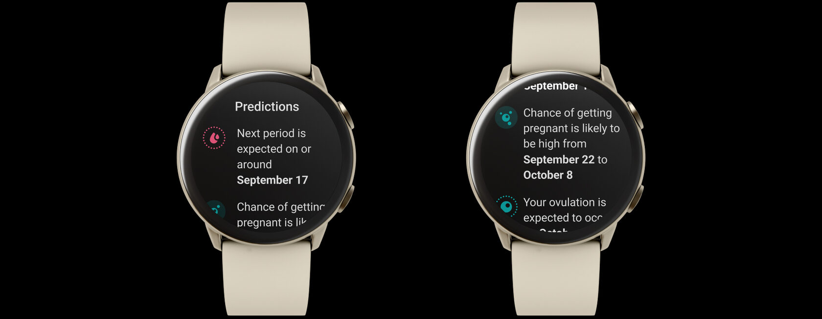
The Predictions feature provides information on “What to expect in my cycle” based on the user’s current cycle day. We had similar functionality in the mobile app but had to adapt it according to users’ contexts using smartwatches.
To design prediction insights, we mapped a timeline with the key cycle phases and events, put possible users’ app settings/modes, and created a unique logic on ordering, prioritization, and wording suitable for the users’ context.
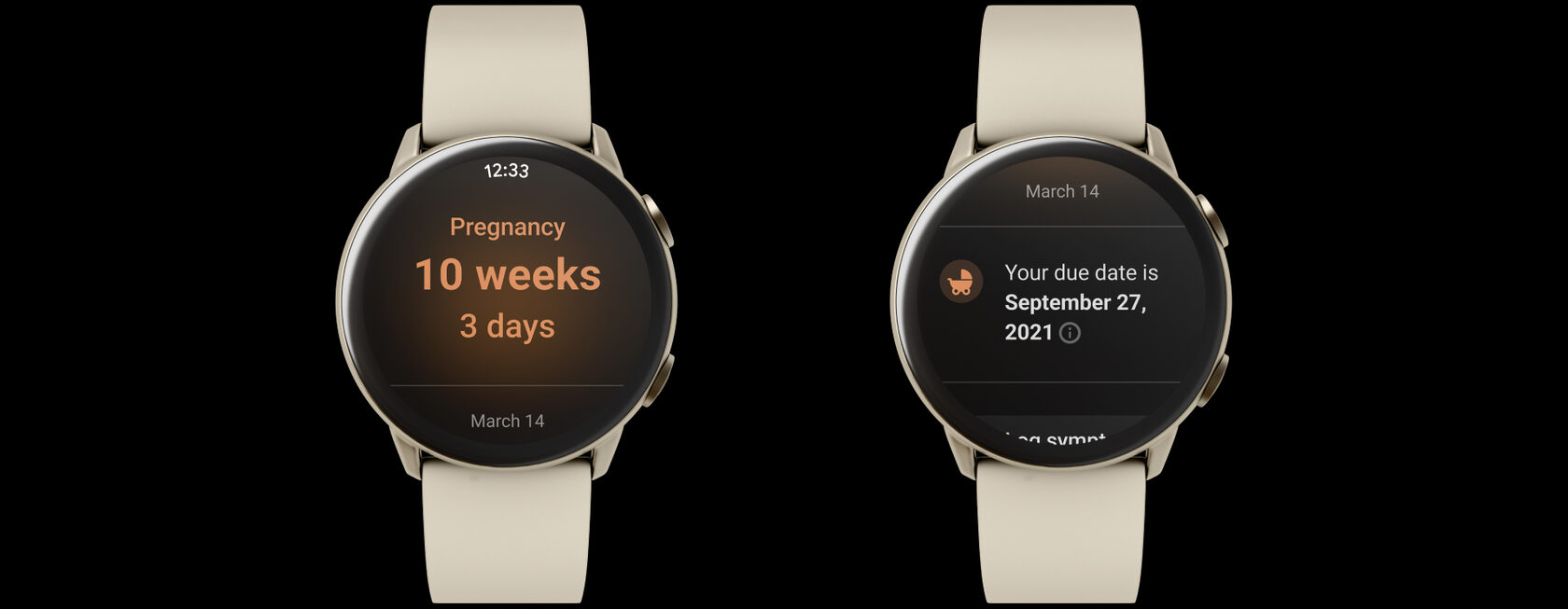
While designing the first version of the watch app, our primary focus was on Track and TTC (trying to conceive) modes. However, we wanted to make the first version support all modes available in the app, even if it will have limited functionality.
So the pregnancy mode functionality covers primary users’ jobs such as “Know my pregnancy week” and “Know my due date.”
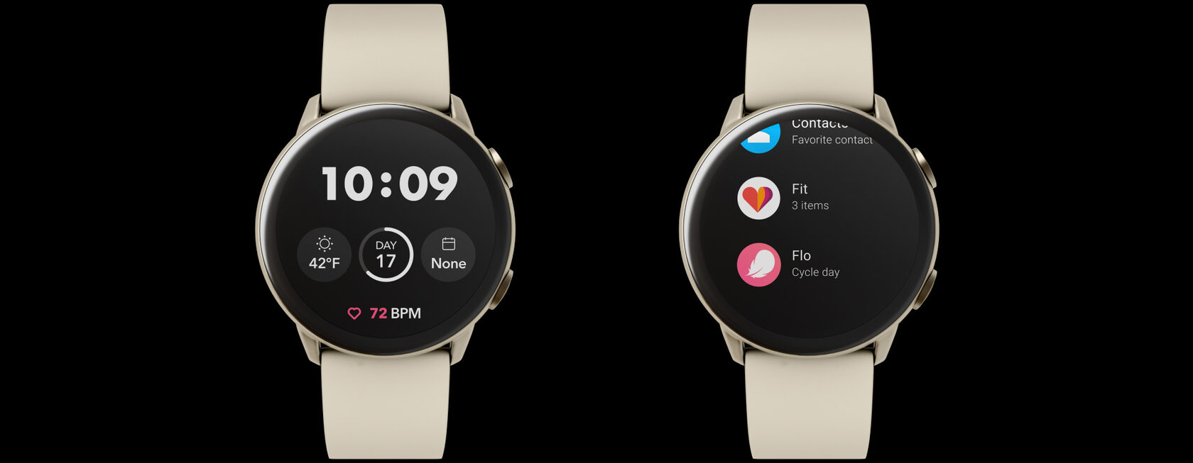
A complication is any feature in a watch face that is displayed in addition to time—for example, a battery indicator, weather condition, calendar, etc.
For the first release, we started with basic functionality covering the essential need of “Where am I in my cycle?”: display the current cycle day or pregnancy week without the support of color coding for different cycle phases and states.
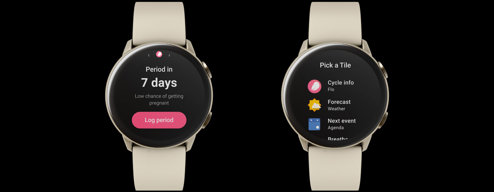
Tiles provide easy access to the information and actions users need to get things done in a matter of seconds. Tiles are available with a simple swipe from the watch face.
Tiles are designed to display critical content. In our case, the first tile we released focuses on two primary users’ jobs: “Where am I in my cycle?” and “How to log my period.”
The watch app was successfully launched on time, which got us featured by Google. Also, launching an Android watch app resulted in a noticeable improvement in Android users’ experience, followed by new endeavors to provide more value for our users.
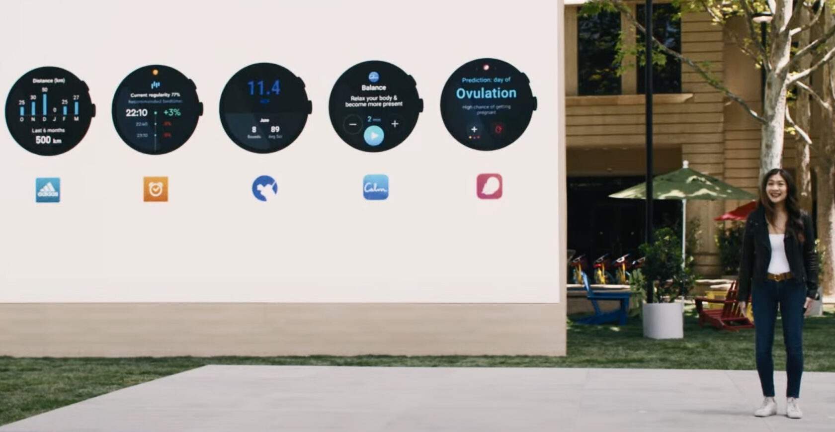
Building Wear OS from scratch showed how important it is to respect platform constraints while preserving the core Flo experience. Testing on a phone when watch tools weren’t ready, prioritising glanceable jobs, and reusing the design system kept the launch focused and on time.
2021
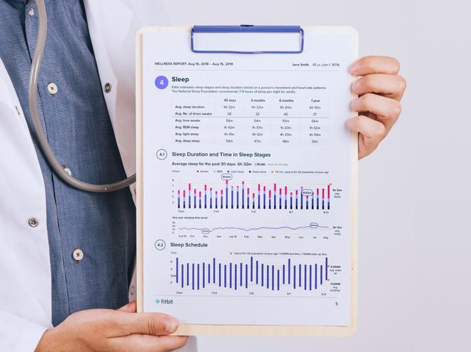
The Wellness Report is a great way to start a conversation with a doctor. This feature allows Premium users to get a PDF with a visualization of their health trends over the last 30 days and the last year.
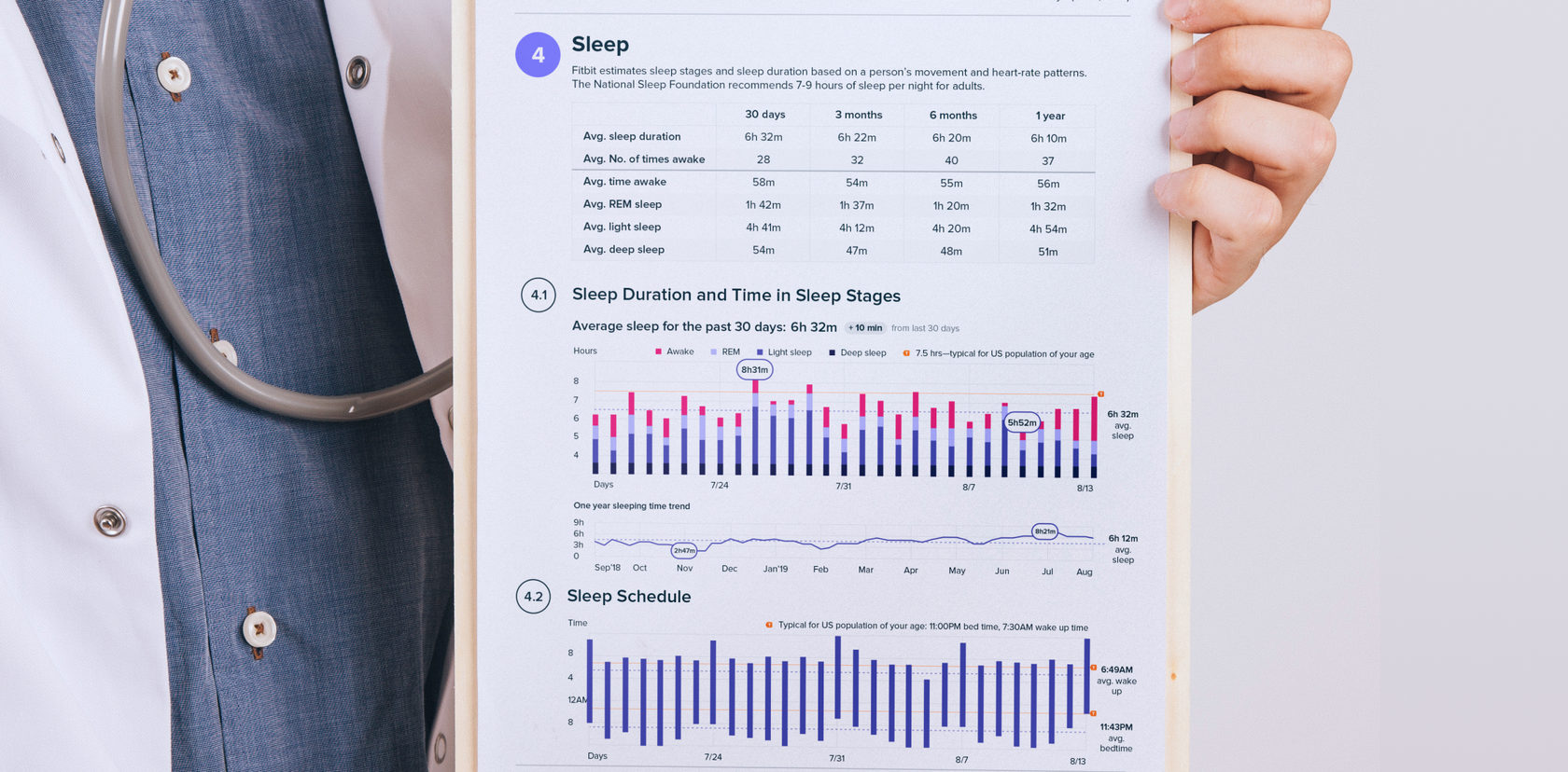
The Wellness Report provides a personalized PDF summary visualizing health trends across key metrics—including heart health, weight, sleep, and activity.
By turning complex data into clear, actionable visuals, the feature bridges the gap between daily tracking and medical insight—helping users and healthcare professionals speak the same language.
Enable Fitbit users to download an easy-to-read health report summarizing their wellness trends so they can walk into a doctor’s appointment prepared, informed, and confident. The design needed to:
How might we transform Fitbit’s continuous health tracking data into a concise, printable, and doctor-friendly format—one that is both easy for users to understand and medically relevant?
This challenge required balancing user experience, medical validity, and data visualization clarity:

At first, we had to define which Fitbit activity and health data are the most useful from a doctor’s perspective. So we created a first draft report that included all the data we could export from the Fitbit app and then asked health experts their opinion about certain data types, their visualization, and the time scale.
As a result, we got a clear picture of first priority data: resting and daily heart rate trends, weight trends, daily steps and active minutes, sleep duration, stages and schedule, and menstrual cycle trends.
These findings defined our data hierarchy and visual focus for the report.
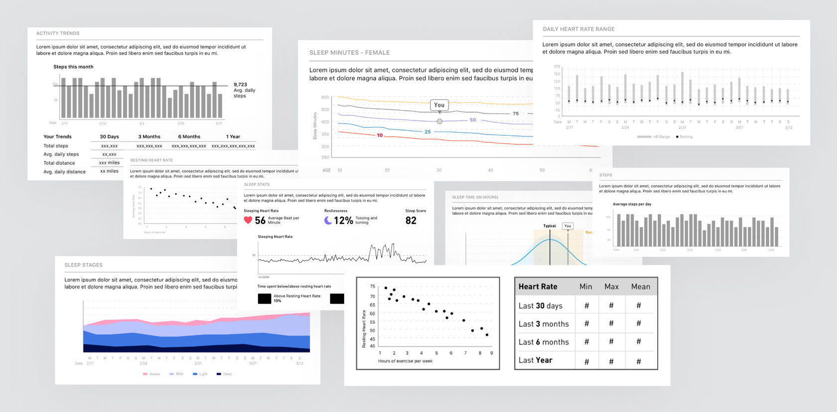
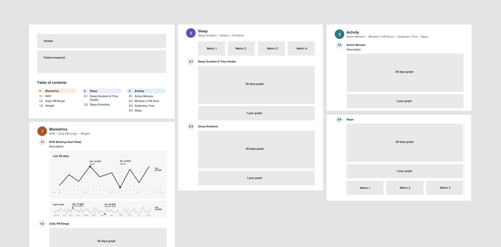
Once we identified the right data set, we focused on creating a clear and logical layout that could work in both digital and printable form.
Key design decisions:
This structure allowed for a narrative flow—from general overview to deeper insights—mirroring how a doctor might conduct a consultation.
We went through several design rounds to refine clarity, hierarchy, and tone:
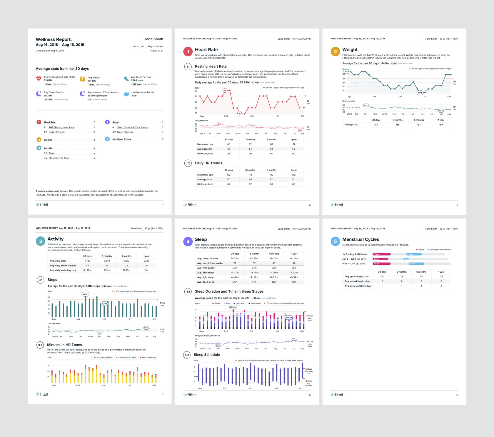
The Wellness Report became a tangible link between Fitbit’s wellness tracking and the healthcare ecosystem—a bridge between personal data and professional insight.
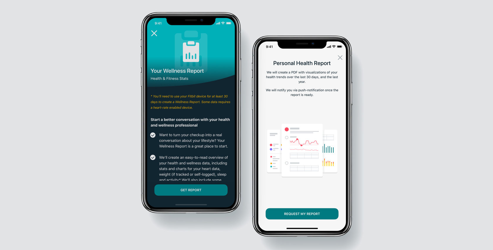
Designing the Wellness Report taught me how important it is to make data relatable. It was more than just charts—trust was crucial. By blending good design with clarity, we helped users feel in control of their health and made it easier for doctors to understand their patients’ daily lives.
2019
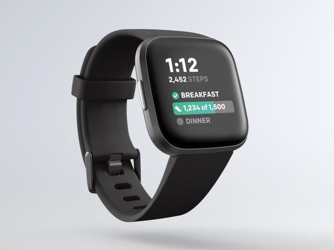
The After Meal Steps clock face is a part of the Glucose Management Program made in a partnership with United Healthcare. The clock face allows viewing daily step goals, getting meal reminders, and tracking after-meal steps.
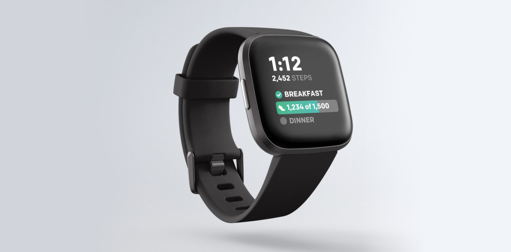
This project aimed to create a gentle nudge mechanism for users managing their glucose levels—encouraging physical activity right after eating to improve overall health outcomes, to help users build healthy habits through simple daily actions: viewing step goals, getting meal reminders, and tracking steps after meals.
Design a Fitbit smartwatch experience that:
In essence, we wanted to turn passive health tracking into active behavior change.
How might we motivate users to take action (walk after meals) using a minimal, glanceable interface on a smartwatch—without making it intrusive or overwhelming?
The key challenges included:
1. Understanding users and context. Discovery research revealed that users, who are aware of their goals, prefer gentle prompts and quick, easy logging over strict reminders or extensive data entry.
2. Defining success. We defined success as achieving higher after-meal step completion rates, improving user satisfaction and engagement, and ensuring a clear, simple visual design.
3. Iteration and testing. We developed two major iterations of the clock face, each followed by internal testing and user feedback sessions.

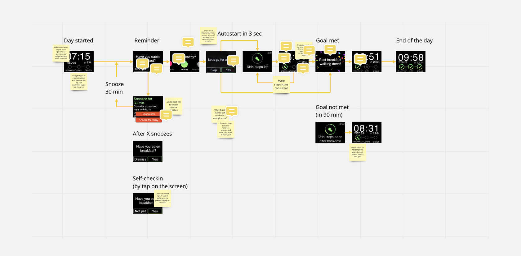
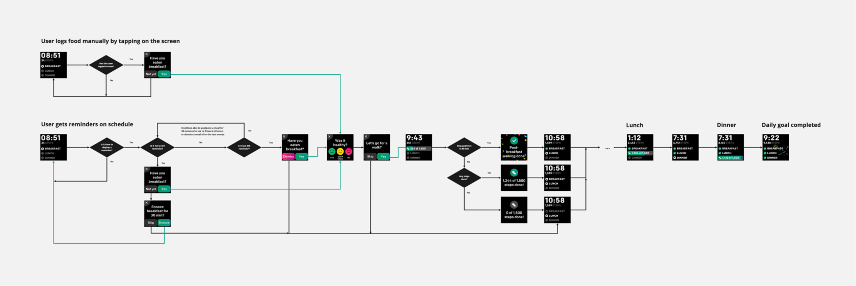
With the first version of the clock face, we covered most user scenarios and tested the core experience. As a result, we got a solid understanding we’re moving in the right direction, but we also need to fix and improve several issues. The first version included:
1. After meal reminders with a possibility to set reminders time;
2. Possibility to snooze reminders;
3. Healthy/not healthy meal survey;
4. Progress for certain goal completion;
5. Overall goal completion progress during the day.
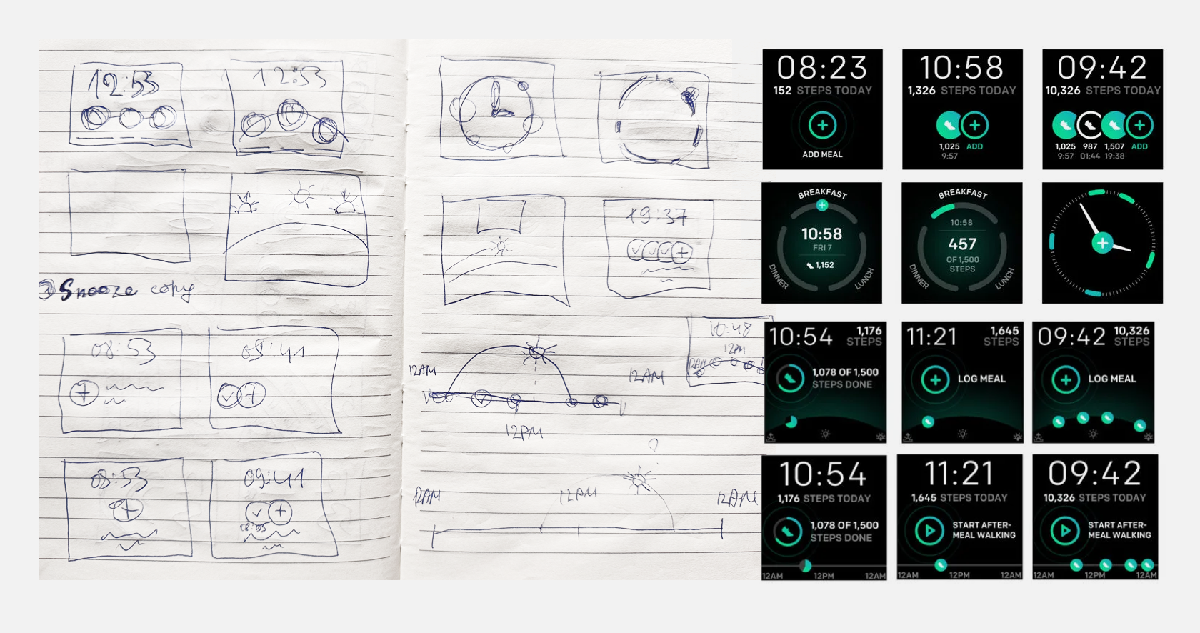
After a series of iterations and user testings, we refined both the interaction and visual design to make the experience more intuitive, accessible, and goal-driven:
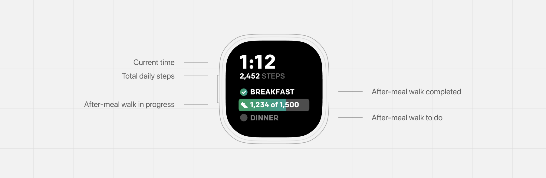
The final watch design focuses on giving users just the right amount of context at a glance. At the top, the current time and daily steps keep the layout anchored in essential, everyday metrics. Below, the after-meal walks are clearly organized by meal, making it easy to see what’s completed and what’s next. A progress bar within each meal section shows steps taken toward the goal—a simple but motivating cue that encourages movement without overwhelming the user. Completed walks are marked with a check for instant recognition, while upcoming ones remain muted, maintaining visual balance and focus. Every element was designed to feel effortless: quick to scan, motivating to glance at, and calm in appearance—perfectly fitting the wearable context.
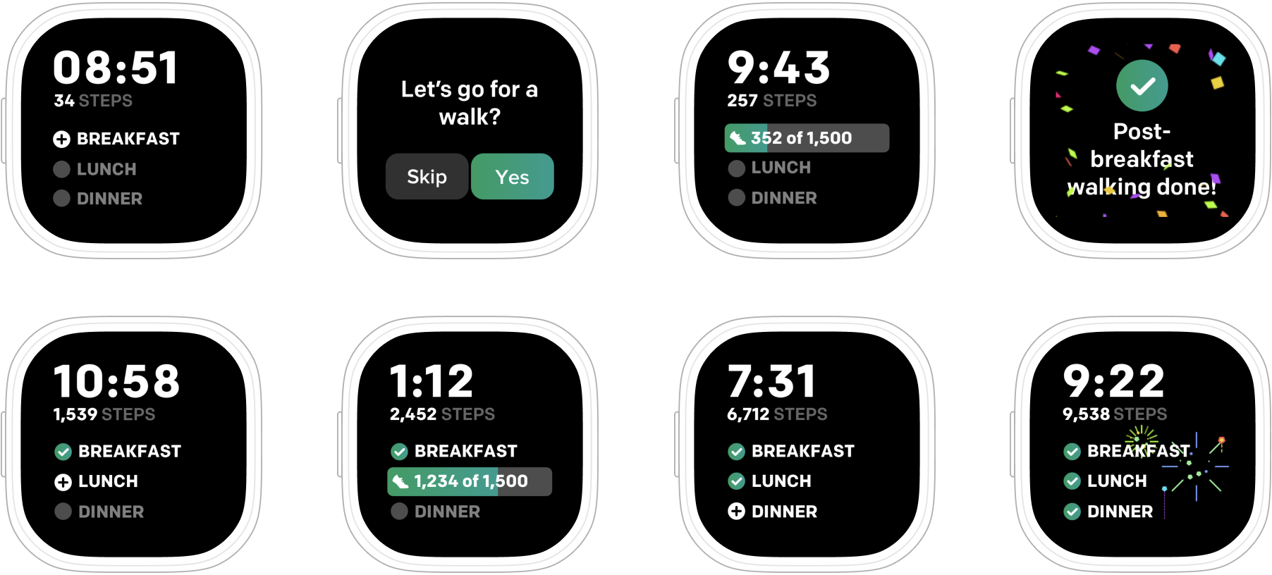
The final version demonstrated improved engagement and higher completion of after-meal walks during pilot testing. Clearer visual hierarchy and accessibility updates resulted in fewer missed interactions. The project strengthened Fitbit’s collaboration with United Healthcare by proving how micro-interactions can drive macro behavior change.
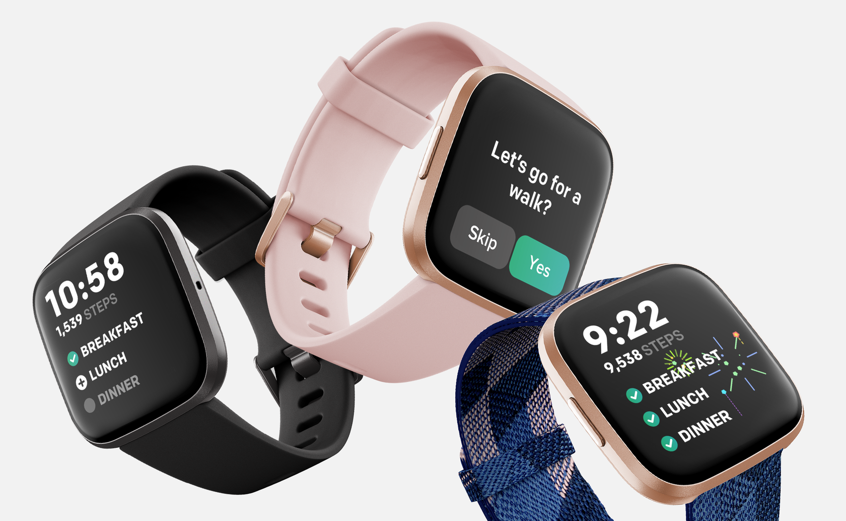
Designing for health behavior on a watch screen taught me how subtle design decisions—timing, tone, visibility—can shape real habits. The biggest takeaway: even small, well-designed moments can create meaningful impact in people’s daily routines.
2019
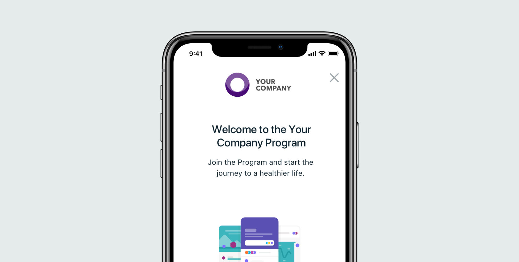
The Fitbit Care engagement platform is a proven way to get employees moving and help them reach their overall health goals. It’s powered by smartwatches, trackers, a mobile app for employees, and an easy-to-use dashboard and reporting tools for employers.
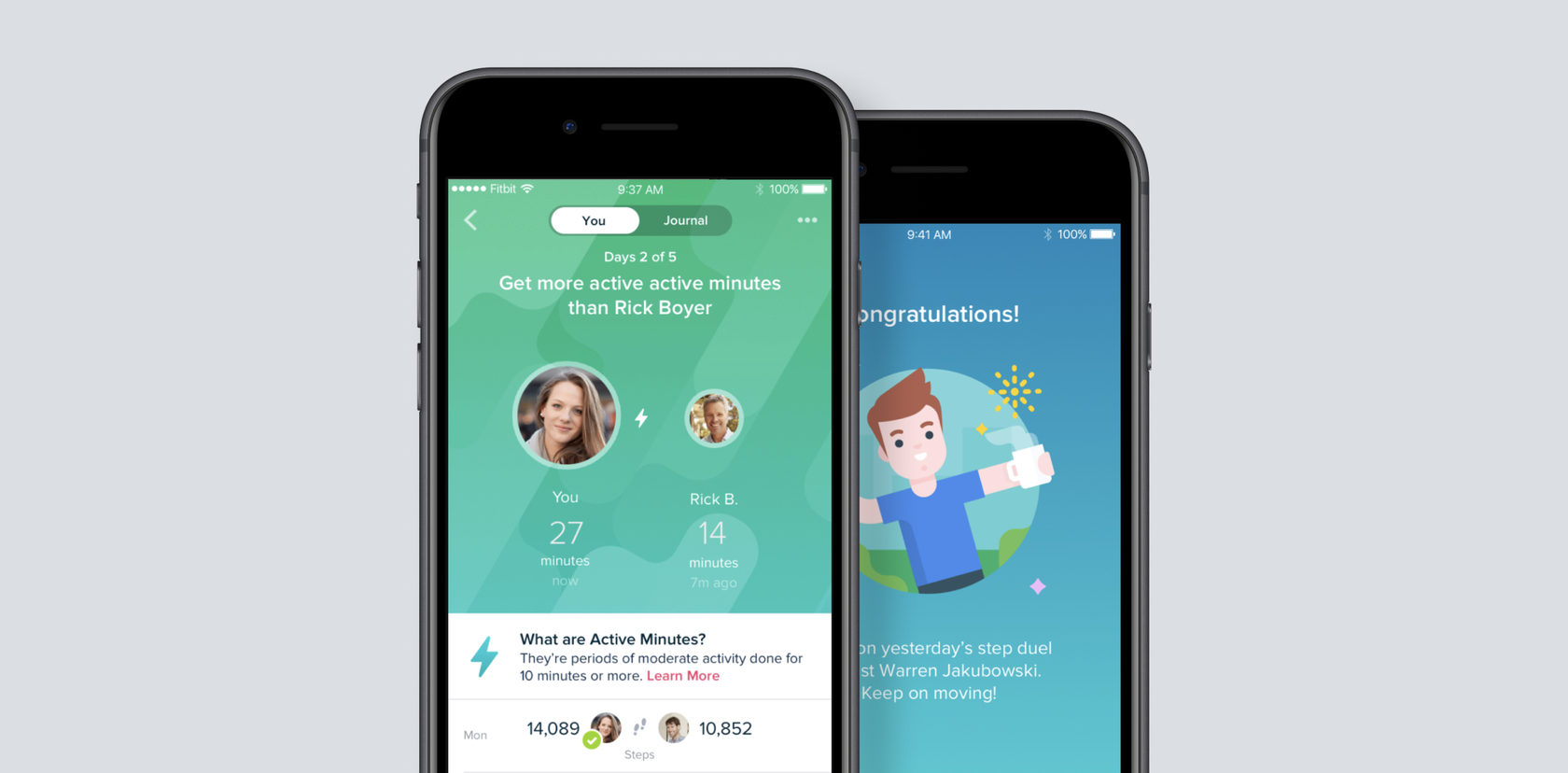
Team challenges bring employees together for healthy competition, no matter their location. It helps bring remote teams together and drive healthy competition and camaraderie with individual and team results. This type of challenges can be launched and managed by the Fitbit Care dashboard.
The main project’s goal was to build a new activity-based challenge to widen the offering in corporate wellness programs and improve employees’ engagement in those programs.
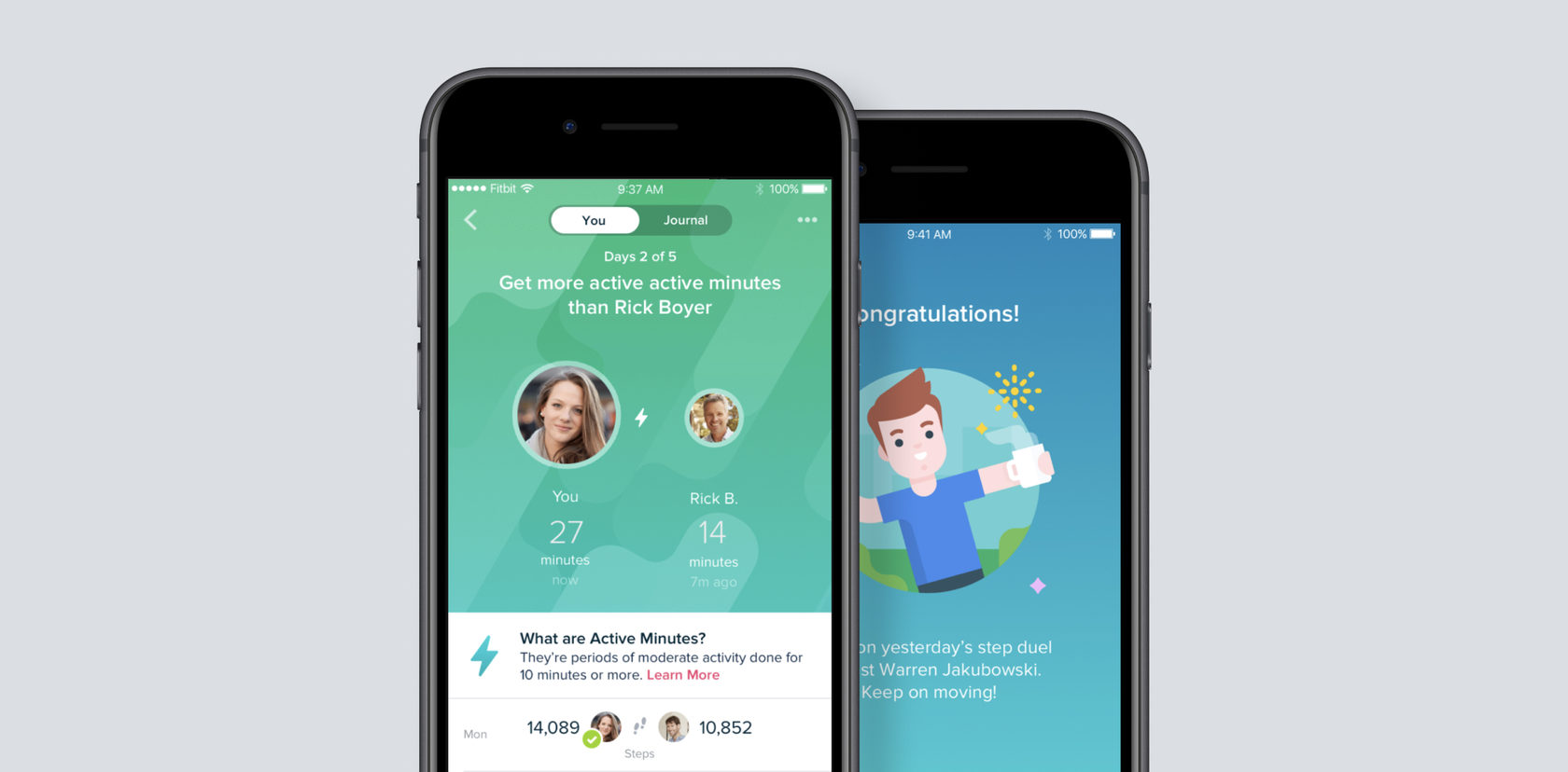
The idea of the Who’s the Boss challenges was to allow employers to conduct step and active minutes challenges between employees and all level managers like department managers or CEOs. Taking part in this challenge, employees have a unique chance to compete with their company leadership team to find out who is a real Step Boss!
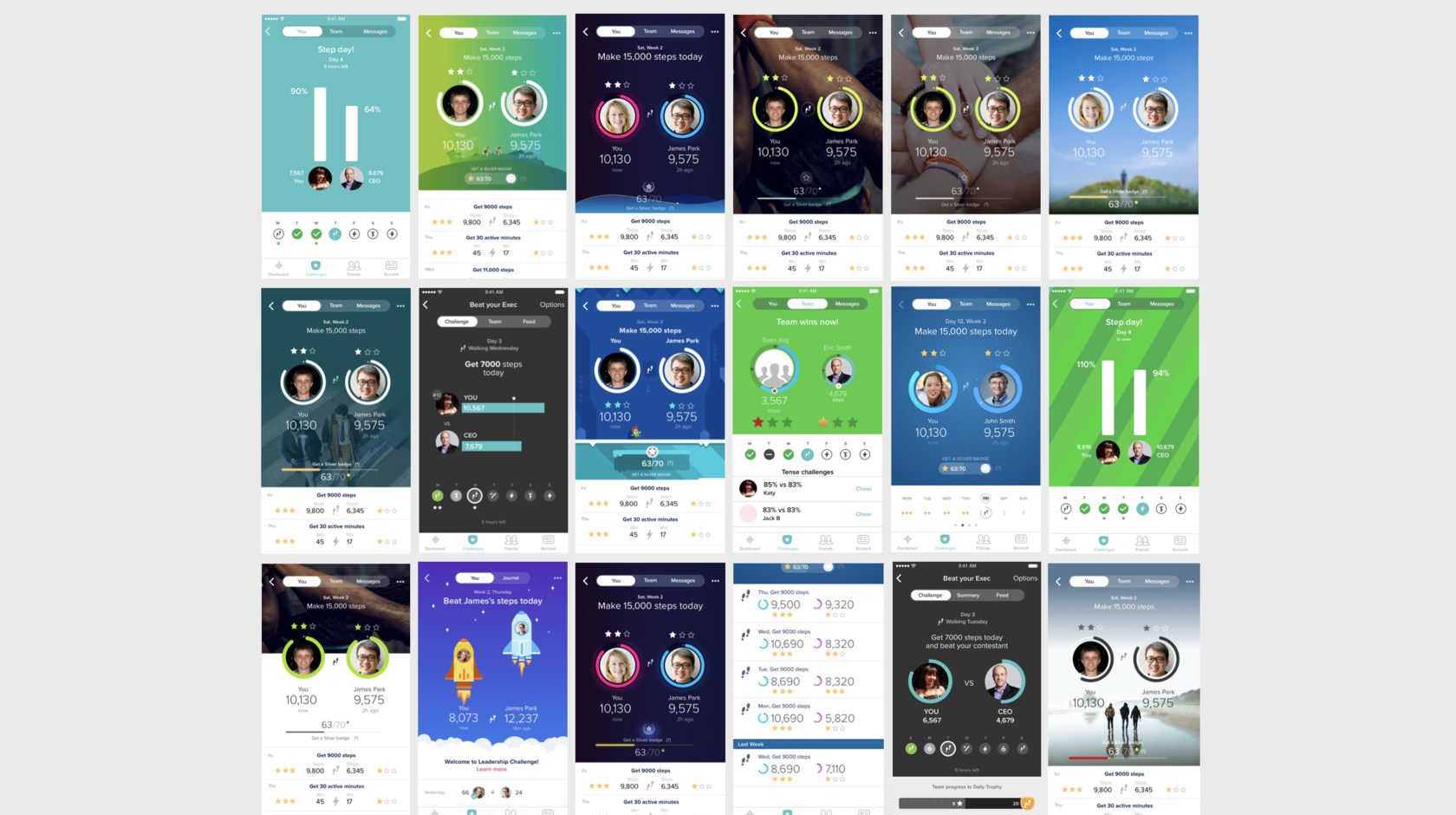
As pre-final ideas, we had three the most suitable for our goal. And the goal was to do the challenge to work, look and feel less competitive but in a more supportive way. Despite that, we had a concept (first screenshot) where employees should have beaten their bosses to win.
User tests showed that the first concept is preferable and straightforward to understand. So lets the battle begin!
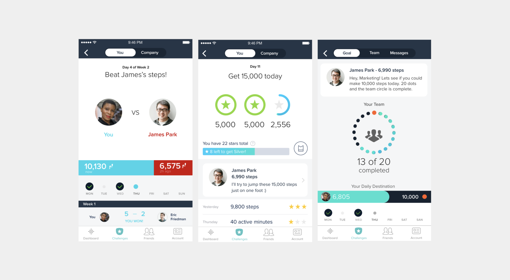
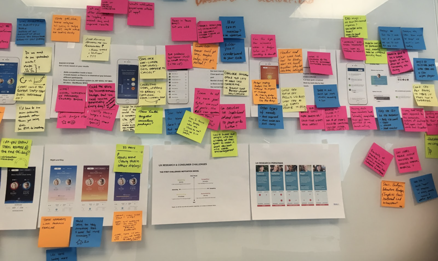
Early internal tests showed us that it’s challenging for employees to compete with their bosses since management people are more likely to be active during the day. So we created separate experiences for leaders’ roles to make them aware of engagement rather than win. Also, we created special journal events to motivate employees and guide bosses.
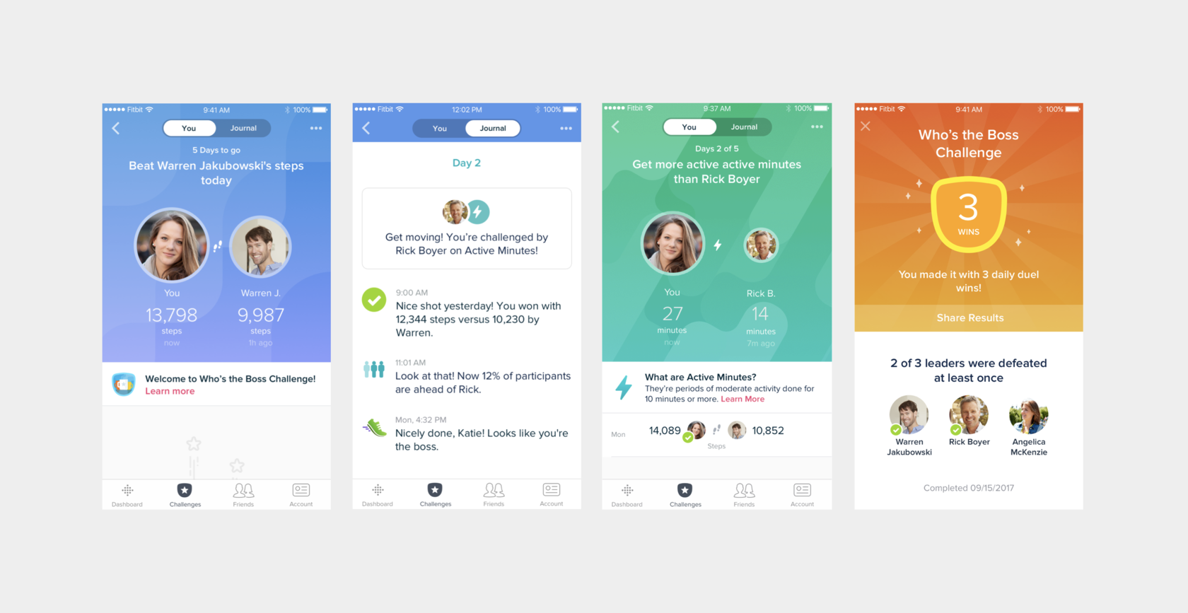
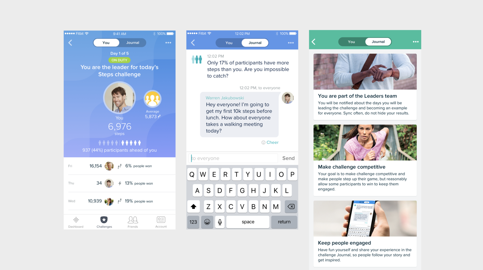
During the challenge, users’ activity increases by +14% average steps per day, +30 active minutes per week, and +19% engagement. Also, nearly 90% of users were interested in continuing using their Fitbit device.
2016–2017
The Fitbit Care engagement platform is a proven way to get employees moving and help them reach their overall health goals. It’s powered by smartwatches, trackers, a mobile app for employees, and an easy-to-use dashboard and reporting tools for employers.
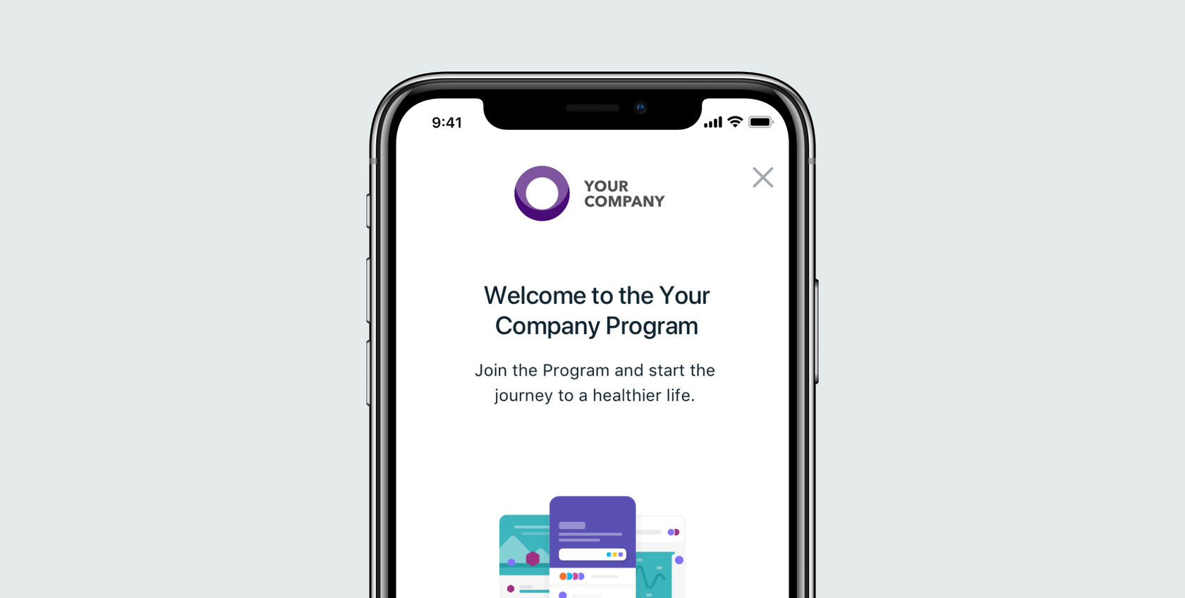
Onboarding is one of the essential parts for Fitbit Care participants. During the onboarding, the platform checks users’ eligibility status, introduces additional program-specific terms, and gives the possibility to access Fitbit Care features.
Users could complete onboarding both via the website or mobile application. Onboarding flow could be triggered by email invitation or by pairing pre-registered Fitbit device.
The old version had several problems we had to solve:
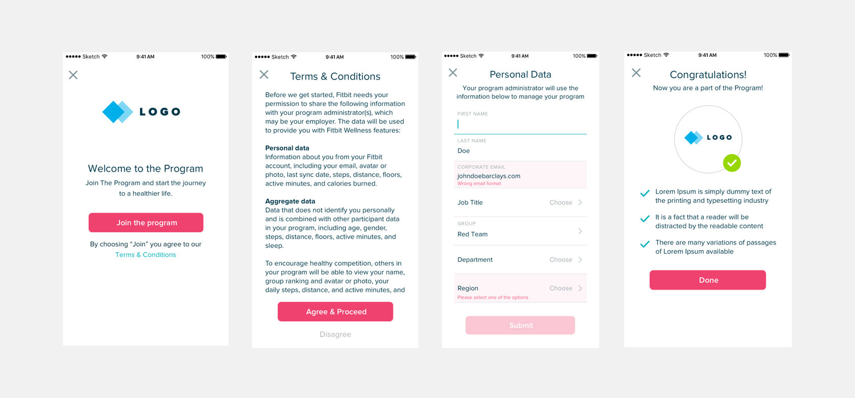
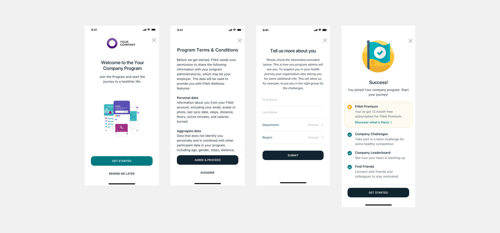
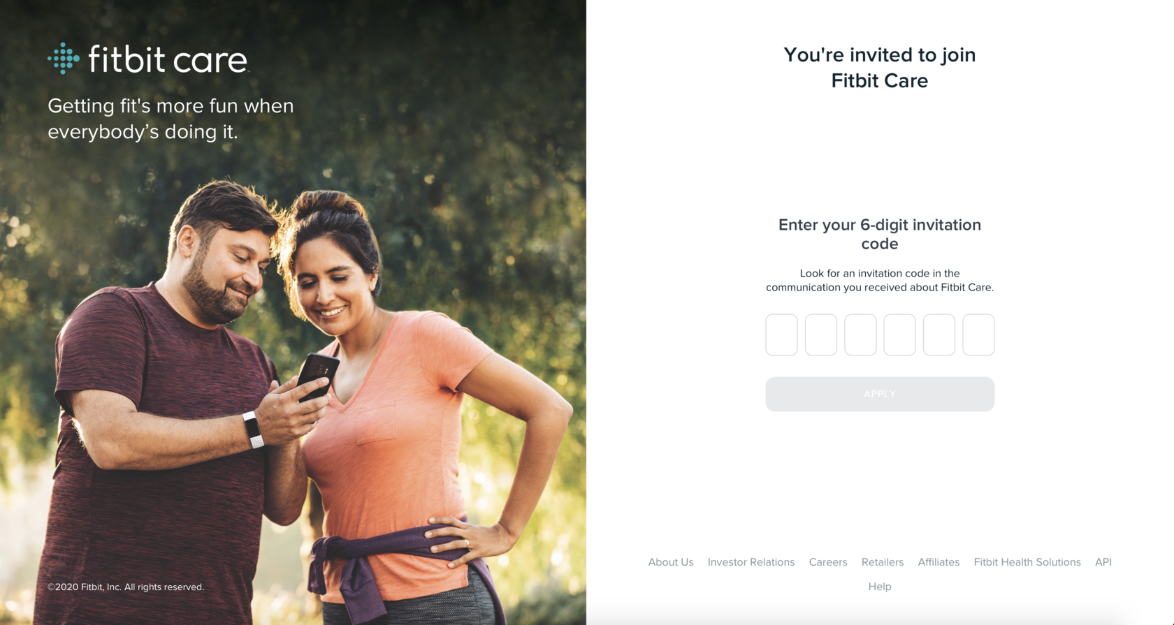
In addition to the existing two possible ways how users can get to the onboarding flow (by email invitation or by pairing pre-registered Fitbit device), we added one more—code-based verification. So users can go to www.fitbit.com/care and enter a code to proceed. Besides, a direct invitation link can be generated based on this web directory so that a verification check will be done automatically.
Updated flow now supports more different scenarios for users taking into account their starting point, environment (web or mobile), and eligibility for certain Fitbit Care Program features. Firstly we mapped users’ flows for different roles to define pain and gain points.
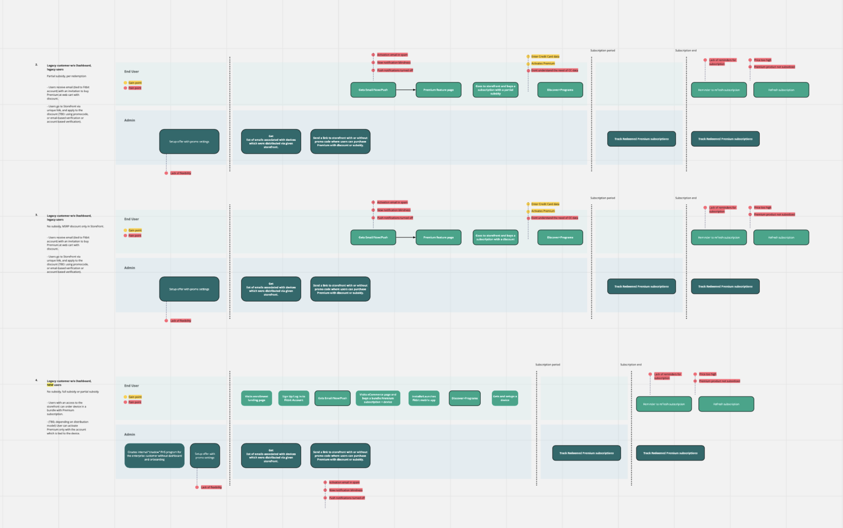
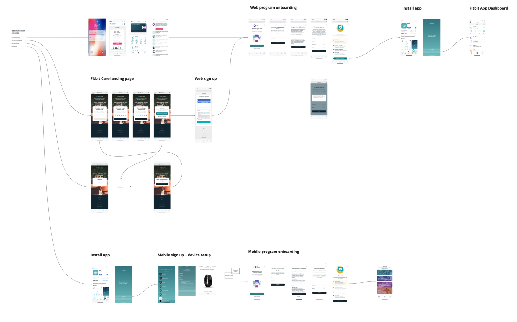
And the last improvement was creating logic for reminding users if they missed the first notification or left the onboarding. The system of reminders is based on the features available for users in the specific Fitbit Care Program. It includes all possible stages from the first invitation to the end when the program is left or expired.
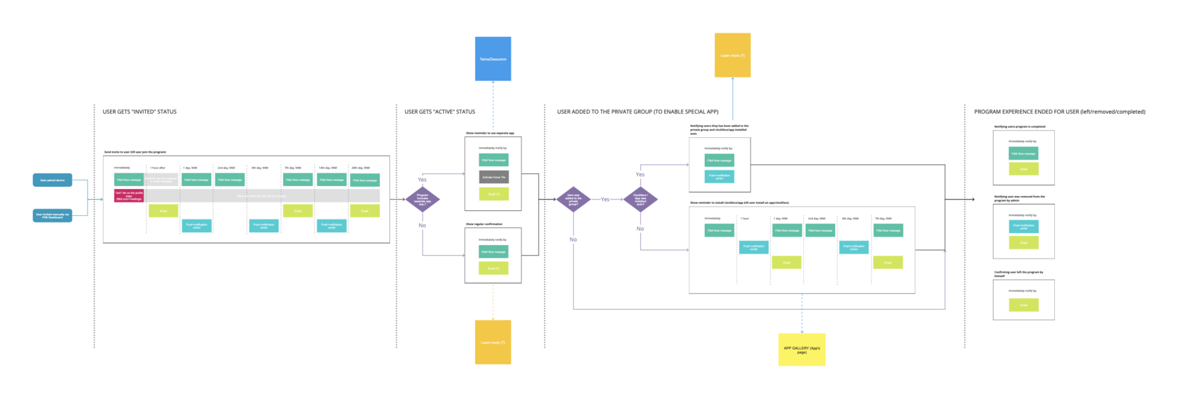
New, improved Fitbit Care onboarding flows showed us up to a 30% better conversion rate. Live Healthy SG (Singapore National Health program), launched in October 2019, was one of the first live programs to test these updates.
2019
The Fitbit Care engagement platform is a proven way to get employees moving and help them reach their overall health goals. It’s powered by smartwatches, trackers, a mobile app for employees, and an easy-to-use dashboard and reporting tools for employers.
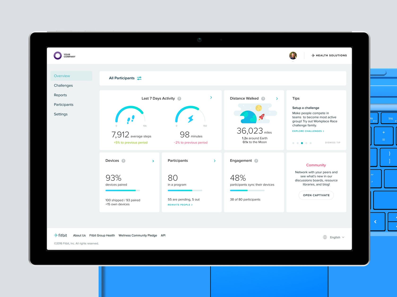
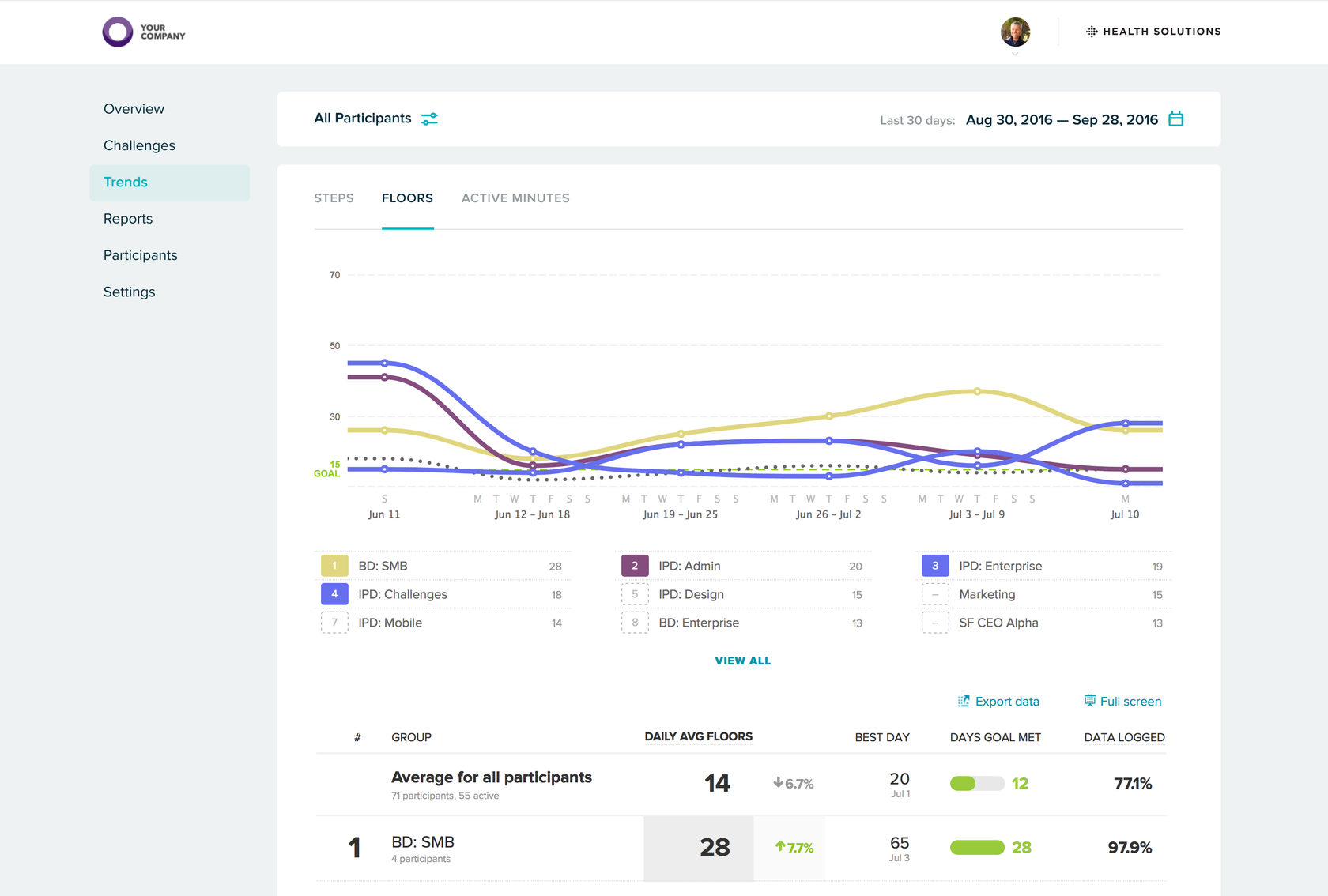
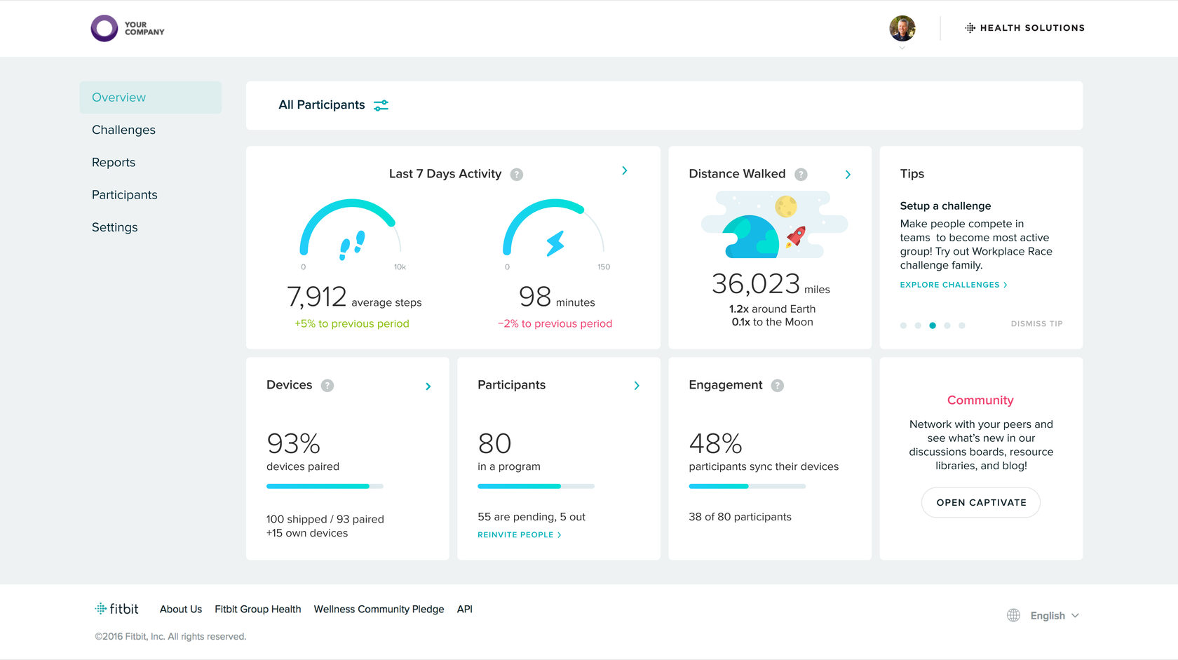
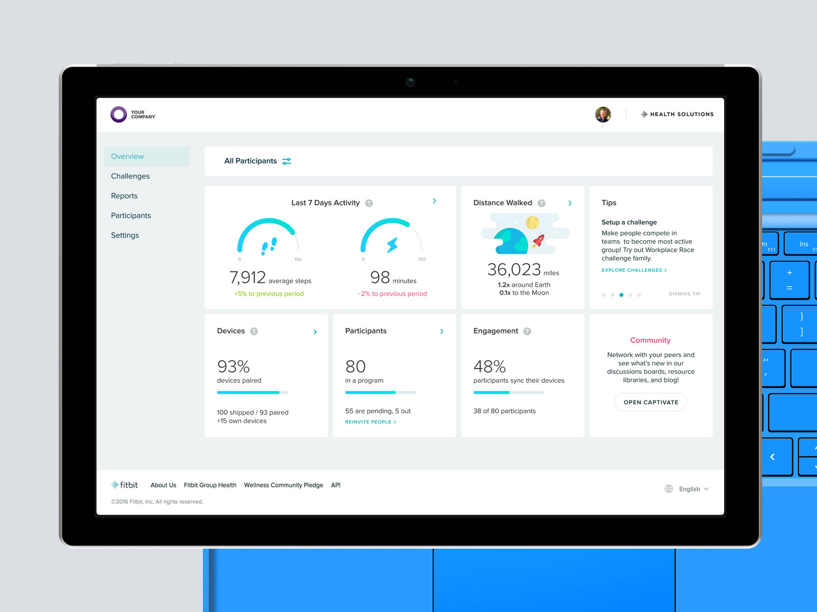
With the program dashboard, administrators can readily evaluate program progress and performance. It shows:
The old version was a bit messy and unclear for admin users and didn’t provide any population activity data and insights (what’s the most critical part). Also, overall navigation wasn’t really flexible in terms of platform growth.
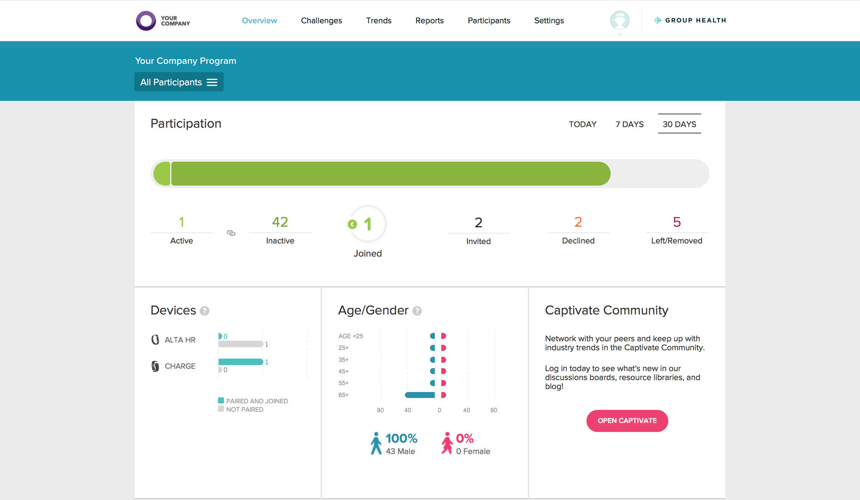
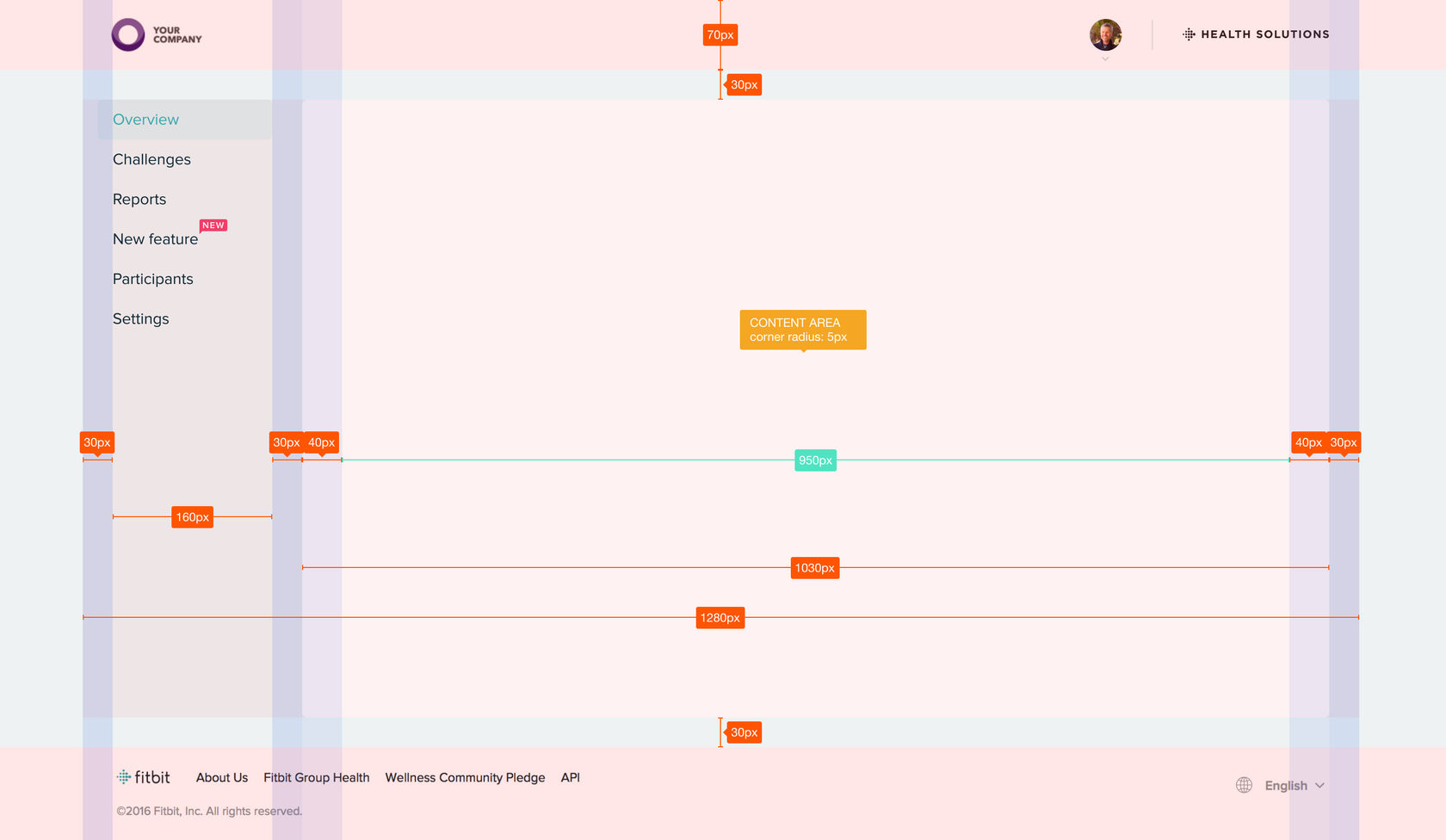
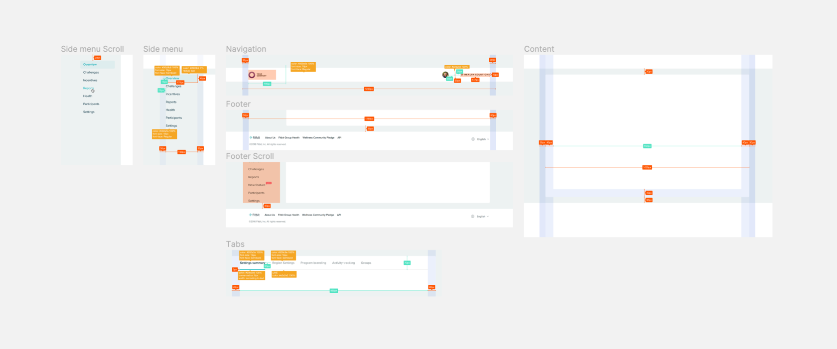
Considering platform growth, it was decided to create side navigation. The header was decided to keep just for program logo and admin profile-related things.
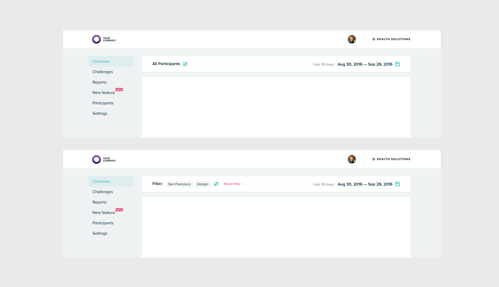
The first redesign iteration included a complete update of the main page and overall grid and navigation and updates for UI controls such as tabs and filters. Other pages were decided to be put inside the content area as is.
2017
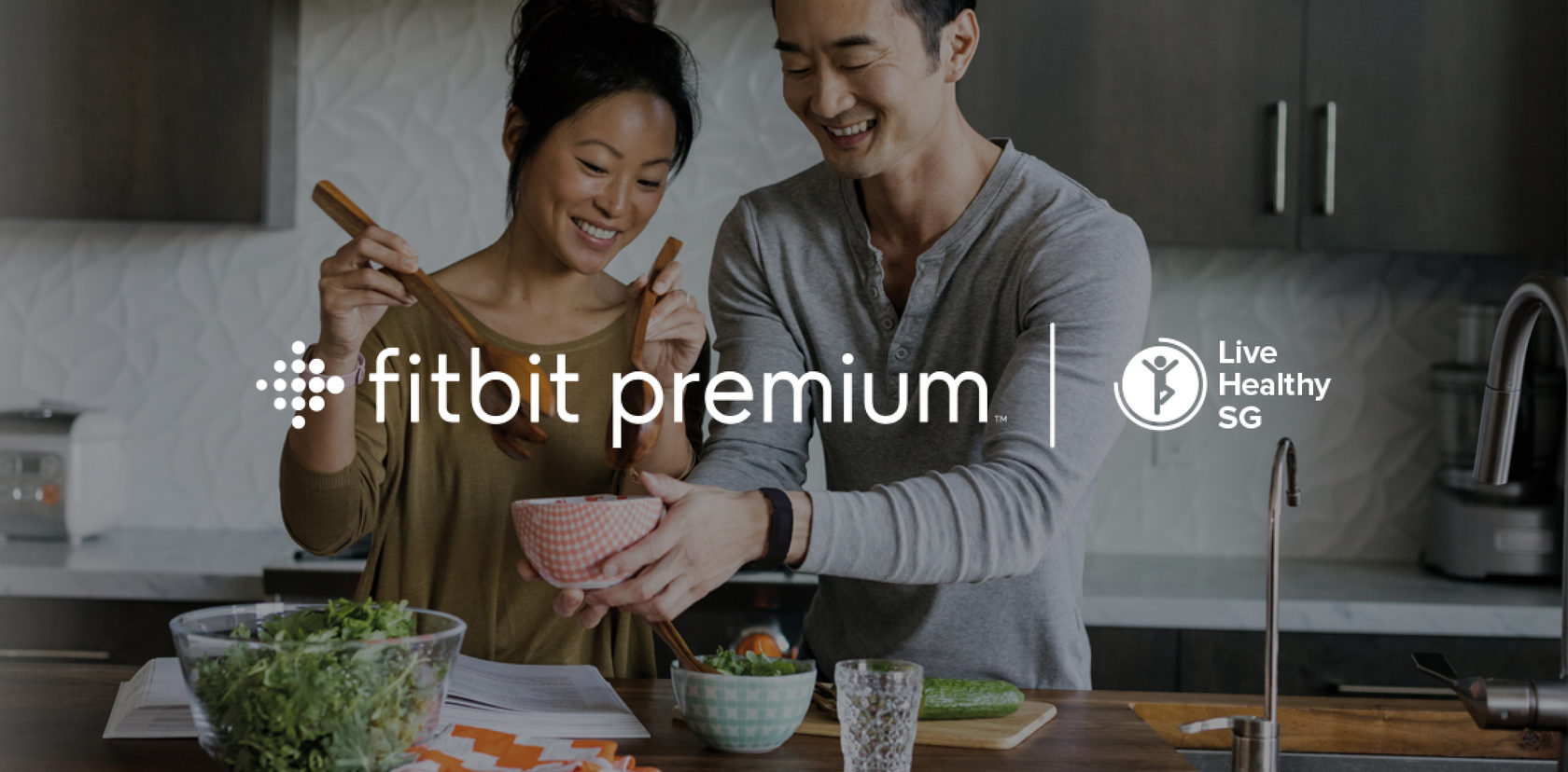
Live Healthy SG is a healthy population initiative developed in collaboration with the Health Promotion Board (HPB) with the support of Singapore’s Smart Nation initiative, powered by Fitbit devices and Fitbit Premium.
Live Healthy SG is uniquely designed for Singapore. Leveraging Fitbit Premium to deliver customized programs, personalized health, fitness guidance, and personal behavior insights to help participants adopt healthier habits to achieve the better physical activity, sleep, nutrition, and emotional well-being outcomes.
Live Healthy SG program should have been based on the Fitbit Care platform and reused its solutions to onboarding Singapore citizens. One of the goals for our team was to map and validate possible onboarding scenarios considering the stages of the program (was planned to add some features later after launch), different starting points, and integration with the Singapore government system (SingPass).
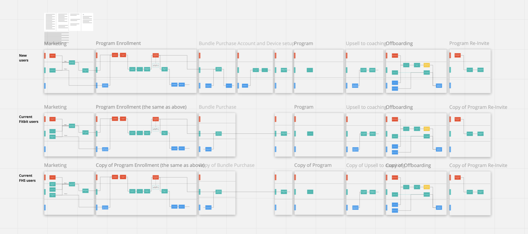
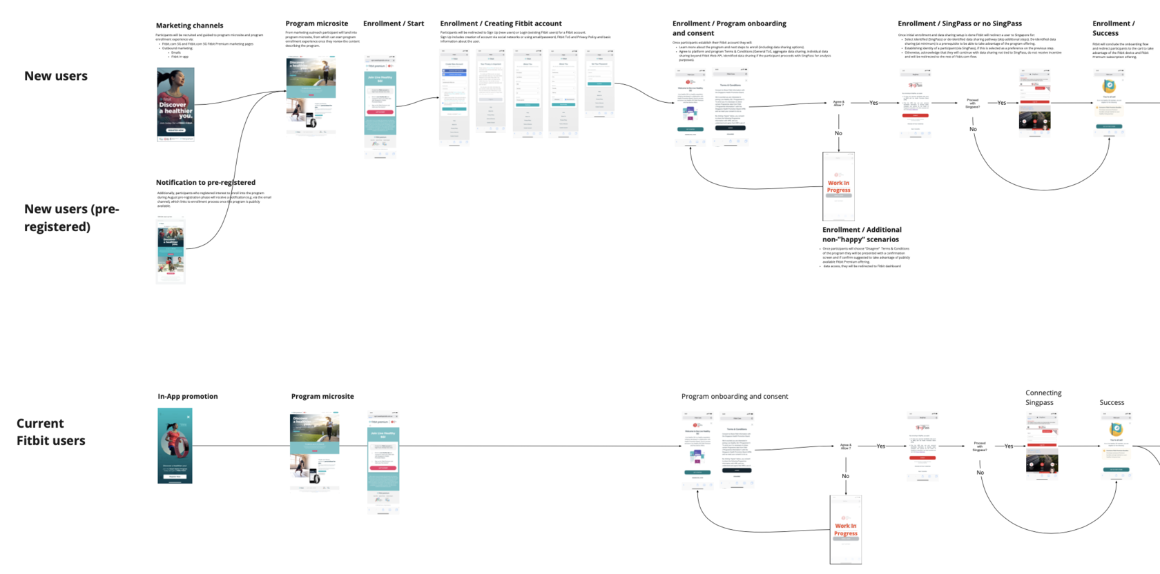
Live Healthy SG program was successfully launched in October 2019. We also launched new, improved Fitbit Care onboarding flows on this project, which allowed us to get up to a 30% better conversion rate.
August-November / 2019
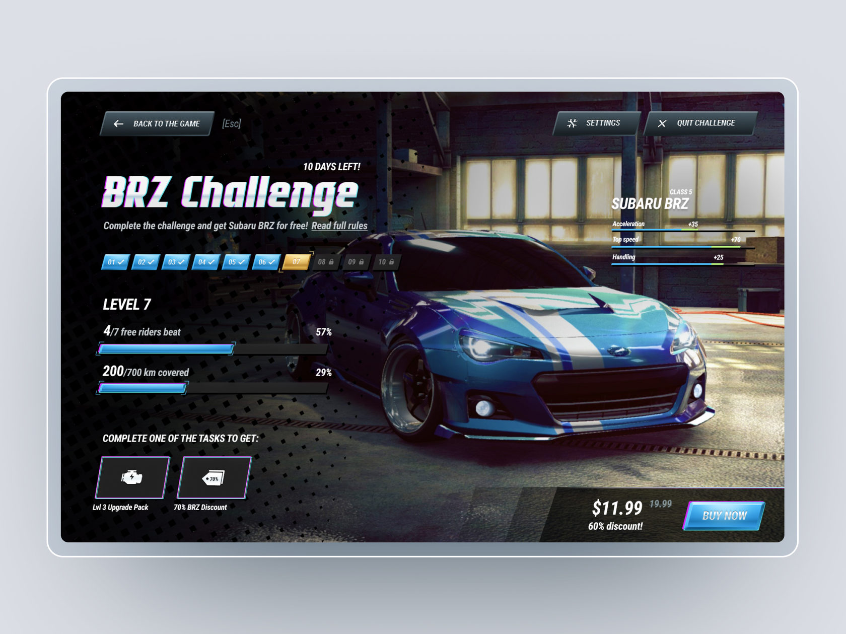
This is a personal design exercise exploring how to add a new type of car to a desktop racing game, not a shipped product, but a concept to practice product thinking, UX flows, and visual design end to end.
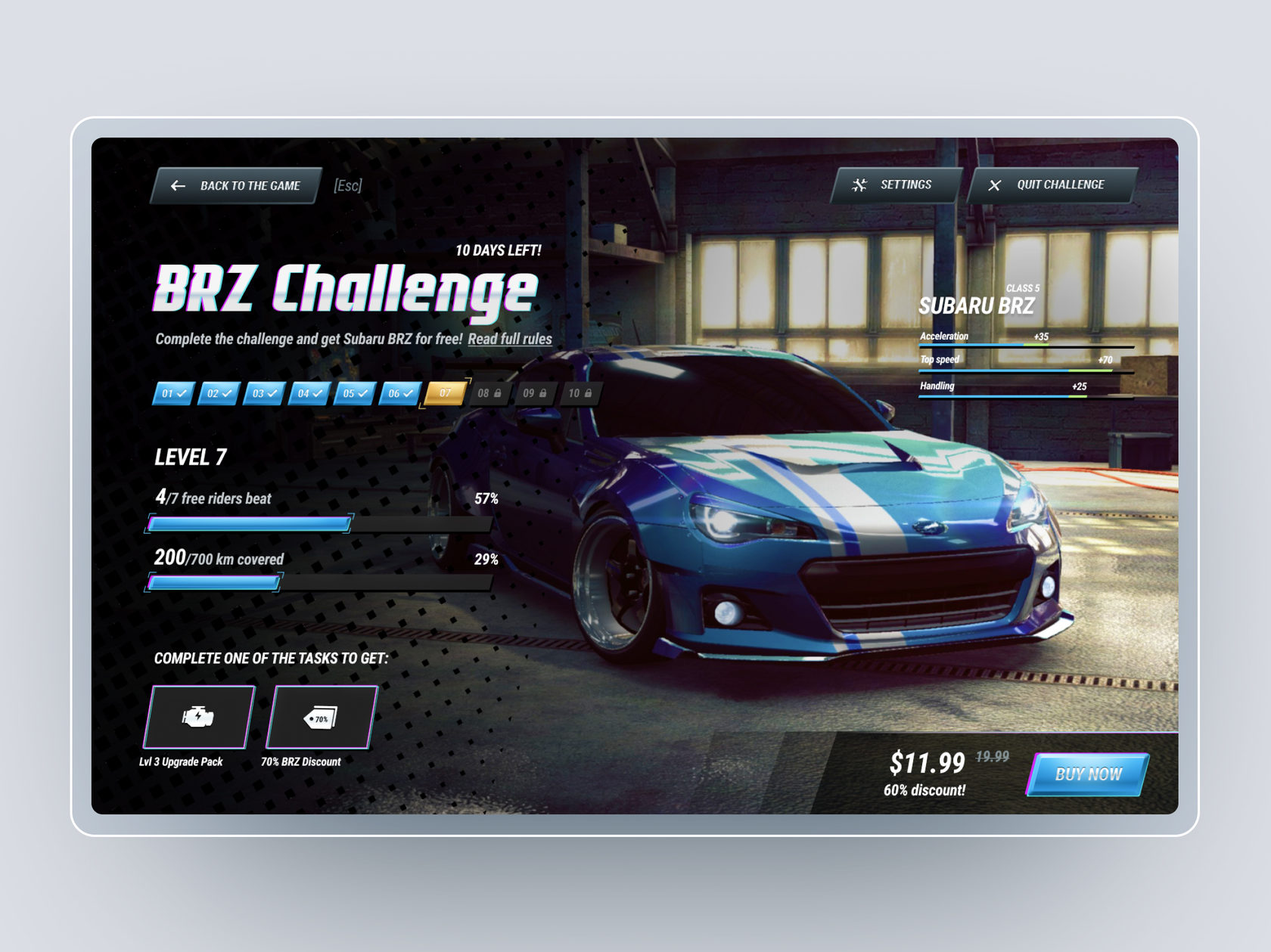
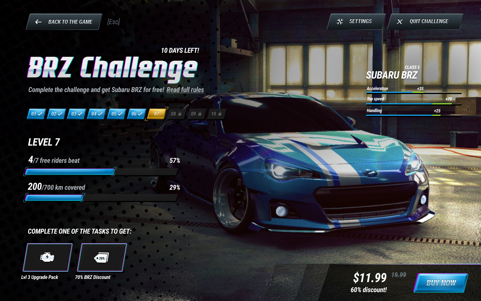
Promote new car by special time-bounded event (challenge) among all players. Challenge consists of 10 levels. Depending on how many levels are completed, users get a certain amount of discount for buying a new car or get it for free if they meet all of the levels. To complete each level, users have to meet one of the level’s tasks—beat a certain number of riders or cover a certain total distance.
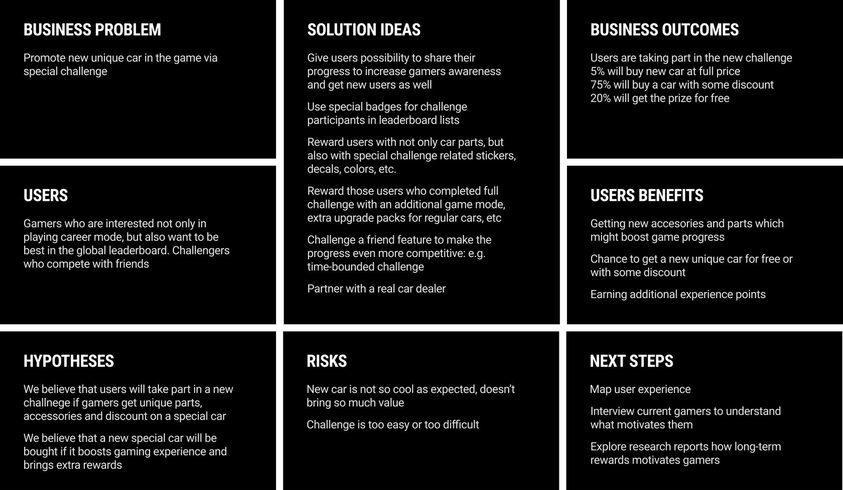
I decided to use Lean UX Canvas as a starting point for my work. It helped me understand the task better and explore some solutions ideas.
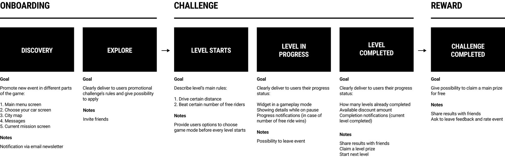
I created a journey map to understand the user’s context better. So I went through the possible stages and explored the essential parts.
I decided to focus on the most “interesting” and important screens to present my initial idea. So I created three wireframes total.
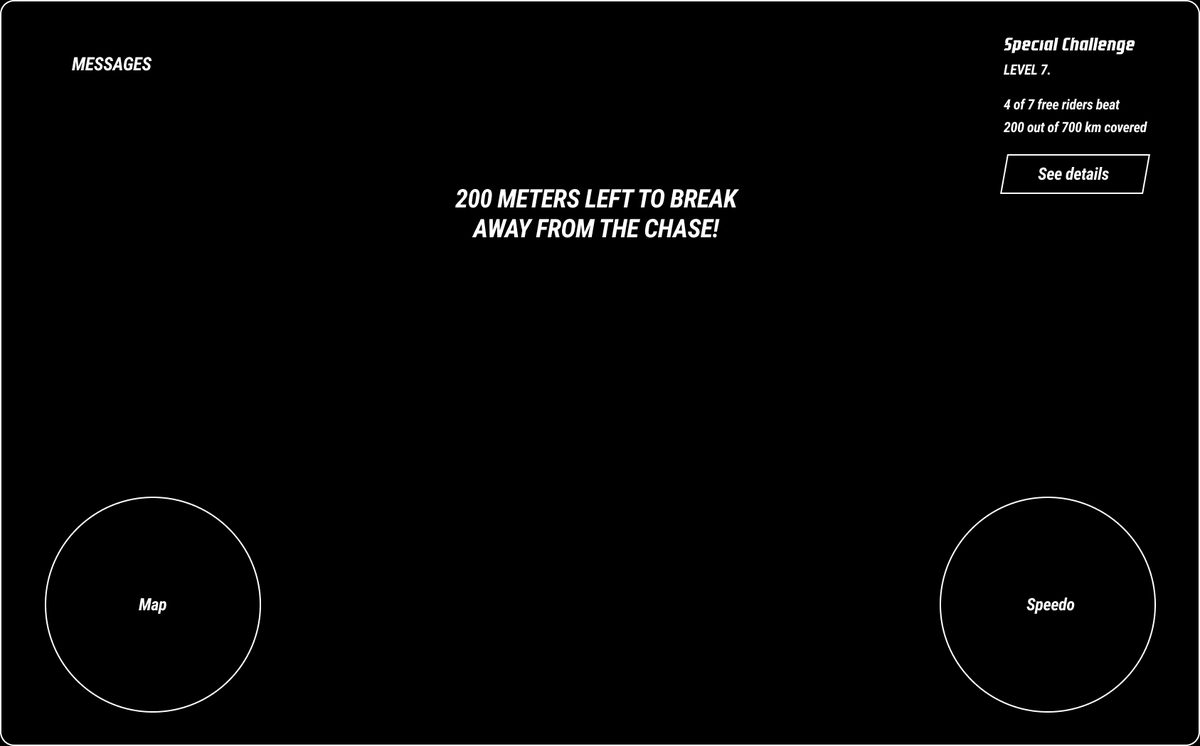
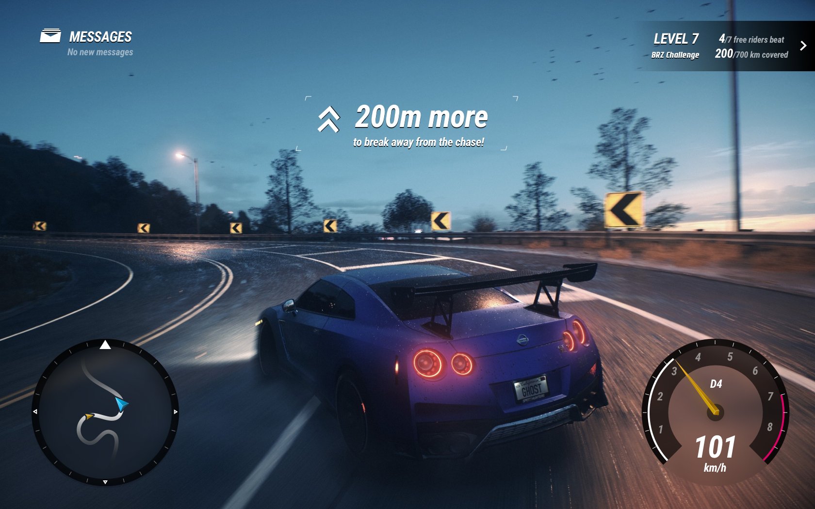
Game in progress screen. The main idea is to provide users immediate feedback on progress in the challenge:
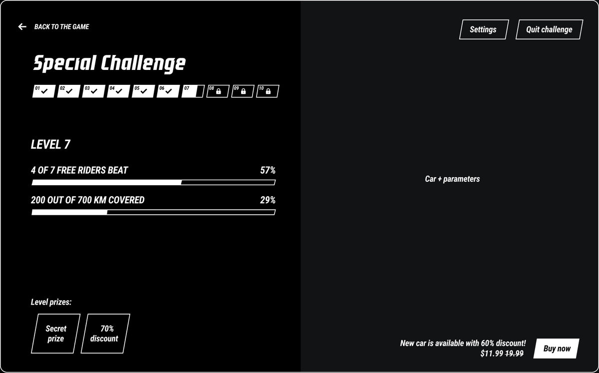
Mission page. The page can be accessed via the challenge widget in gameplay mode. This is the main page showing ongoing progress in the challenge. So here the user can see:
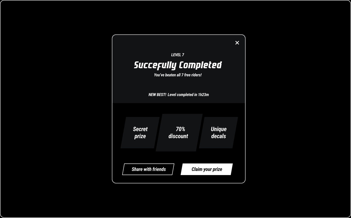
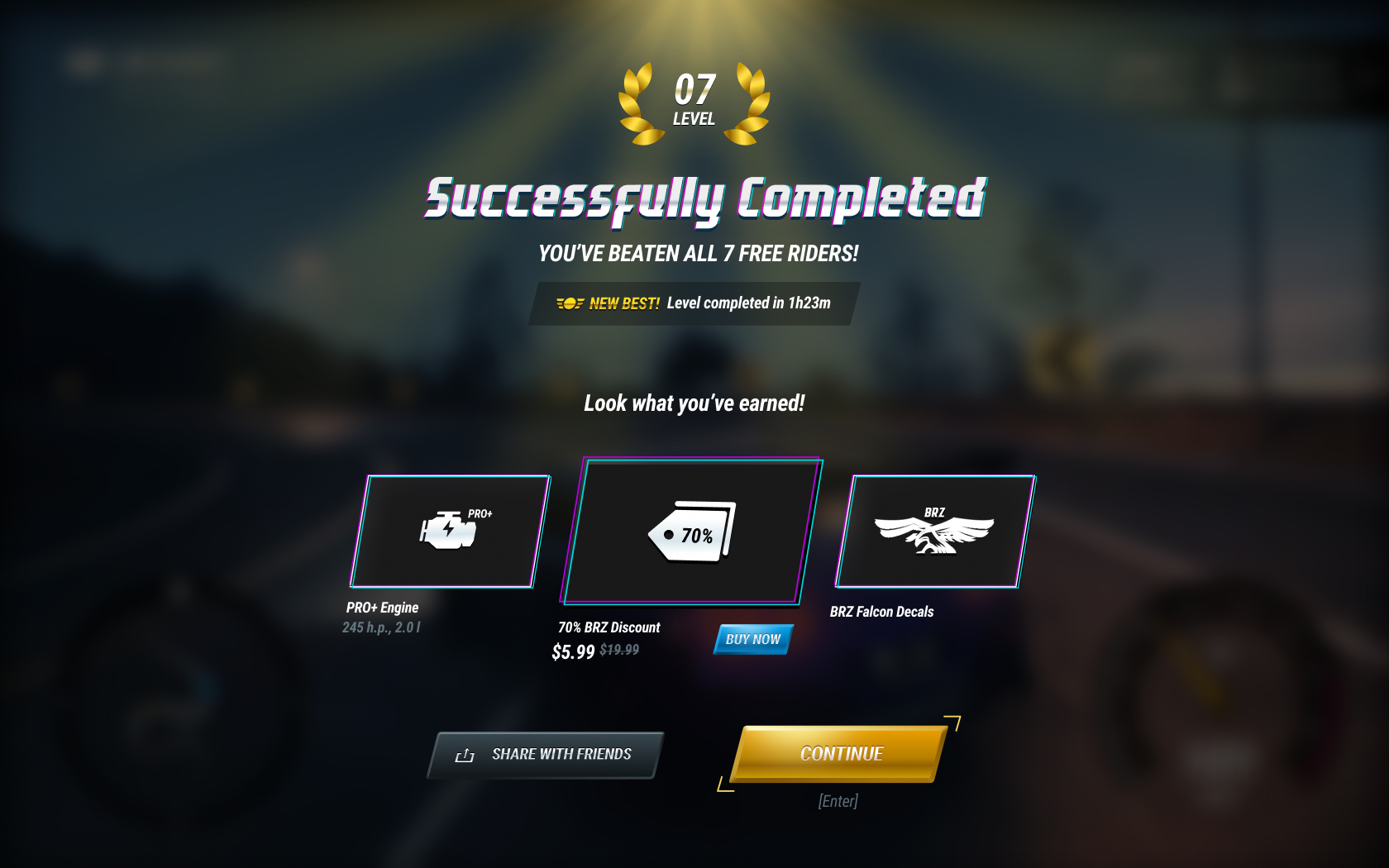
Once the level is completed, users will see a Success screen saying:
May / 2020
Region: Minsk, Belarus.
In collaboration with a key stakeholder, a list of interview goals was created to understand how people manage their free money, how discounts and exclusive offers affect people’s purchase decisions, and to find out more about the motivation and patterns of using credit cards.
After discussion with a key stakeholder, we defined certain groups of people we want to talk with (10 people in total):
Based on initial interview goals, we created a list of specific questions for each goal to get maximum information from respondents. There were created two questionaries:
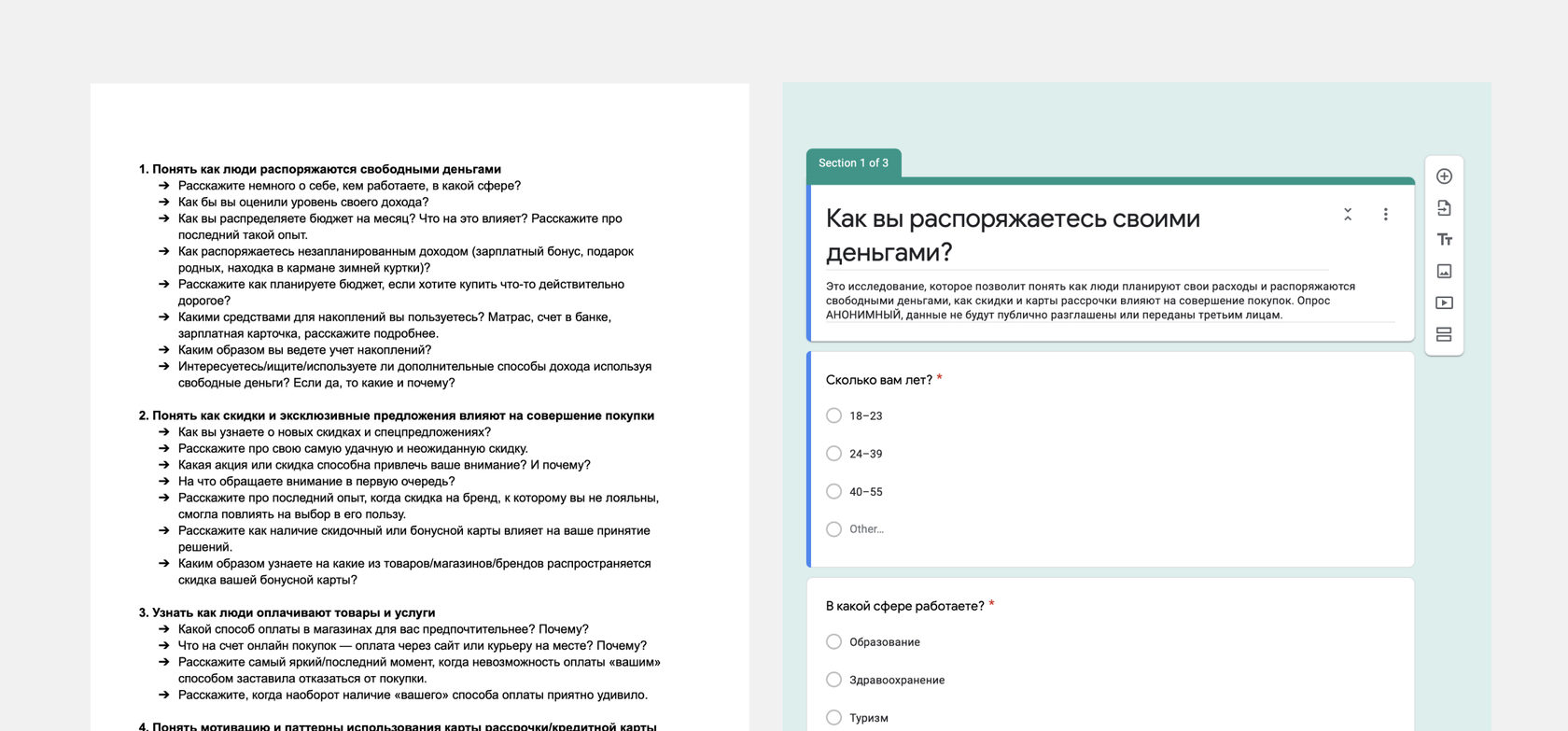
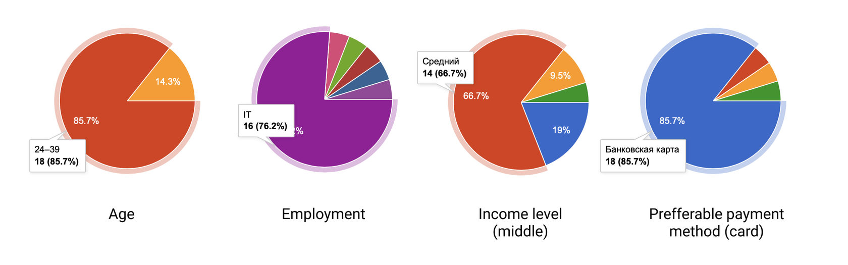
Google questionary form was shared via social networks, so it covered many people from different groups. Some of the highlights showed below.
Personal interview results were collected into one single document. And all of the responses were grouped into three categories: Behavior, Needs, and Challenges.
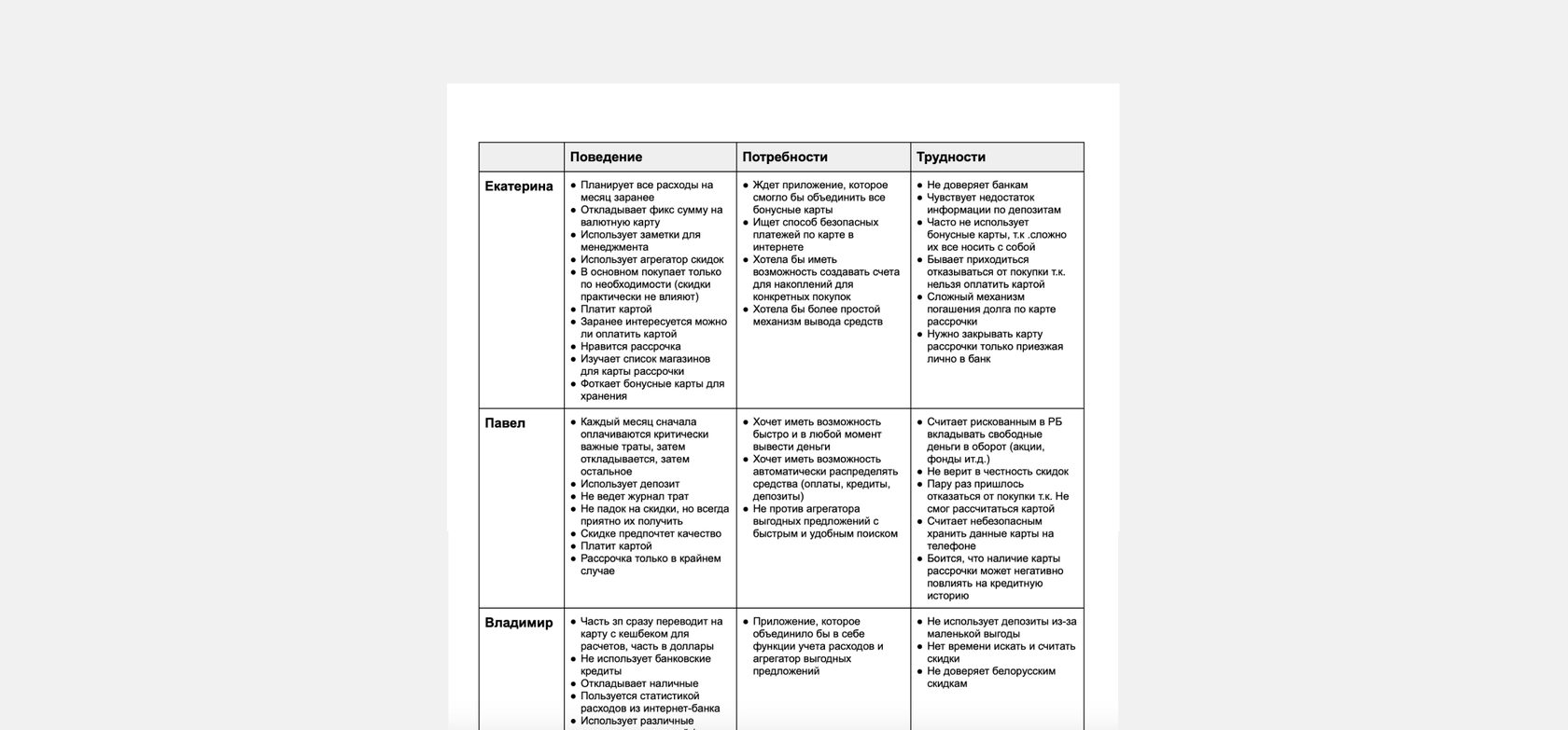
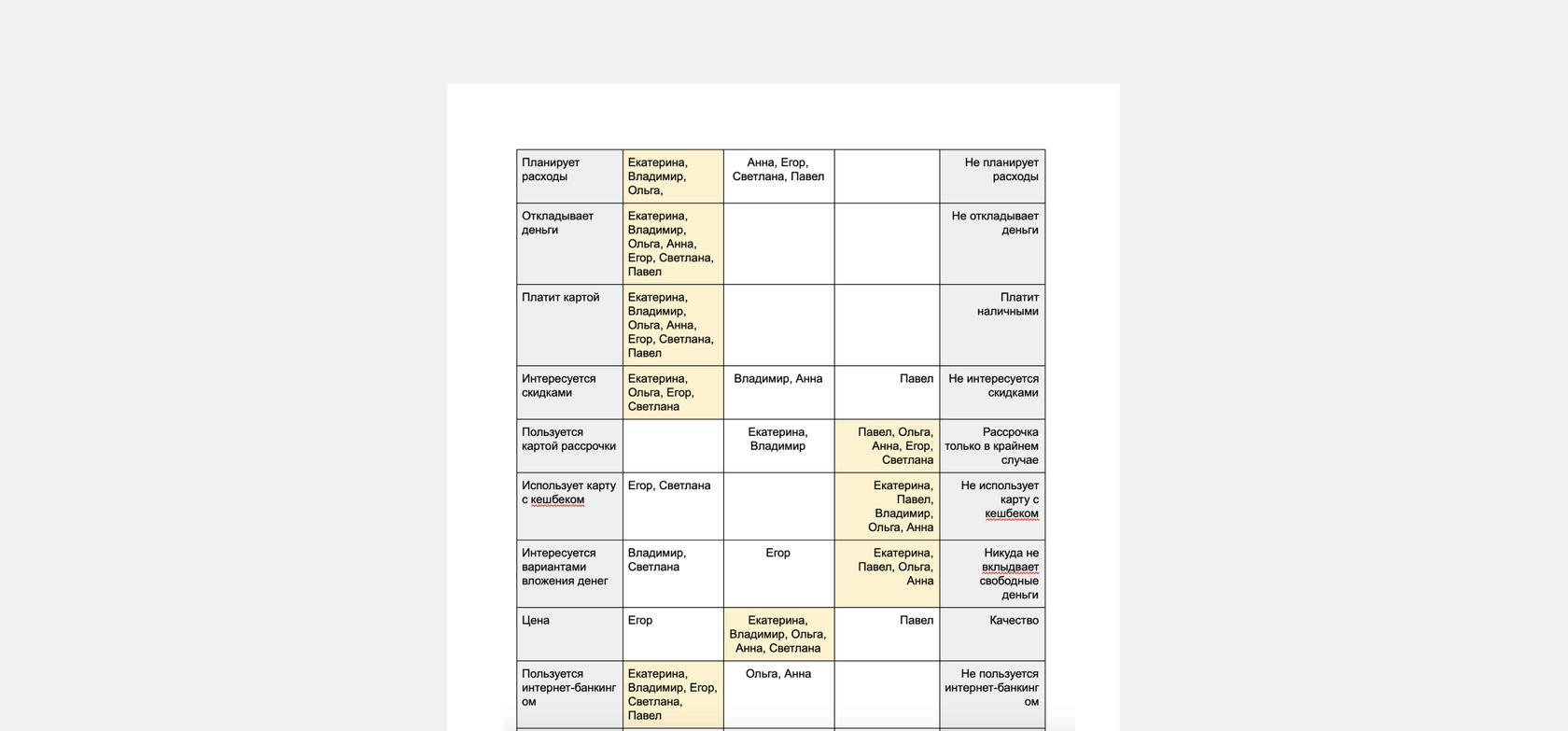
Based on my research data, I created a table with users’ patterns and then distributed respondents according to their responses to find common scenarios.
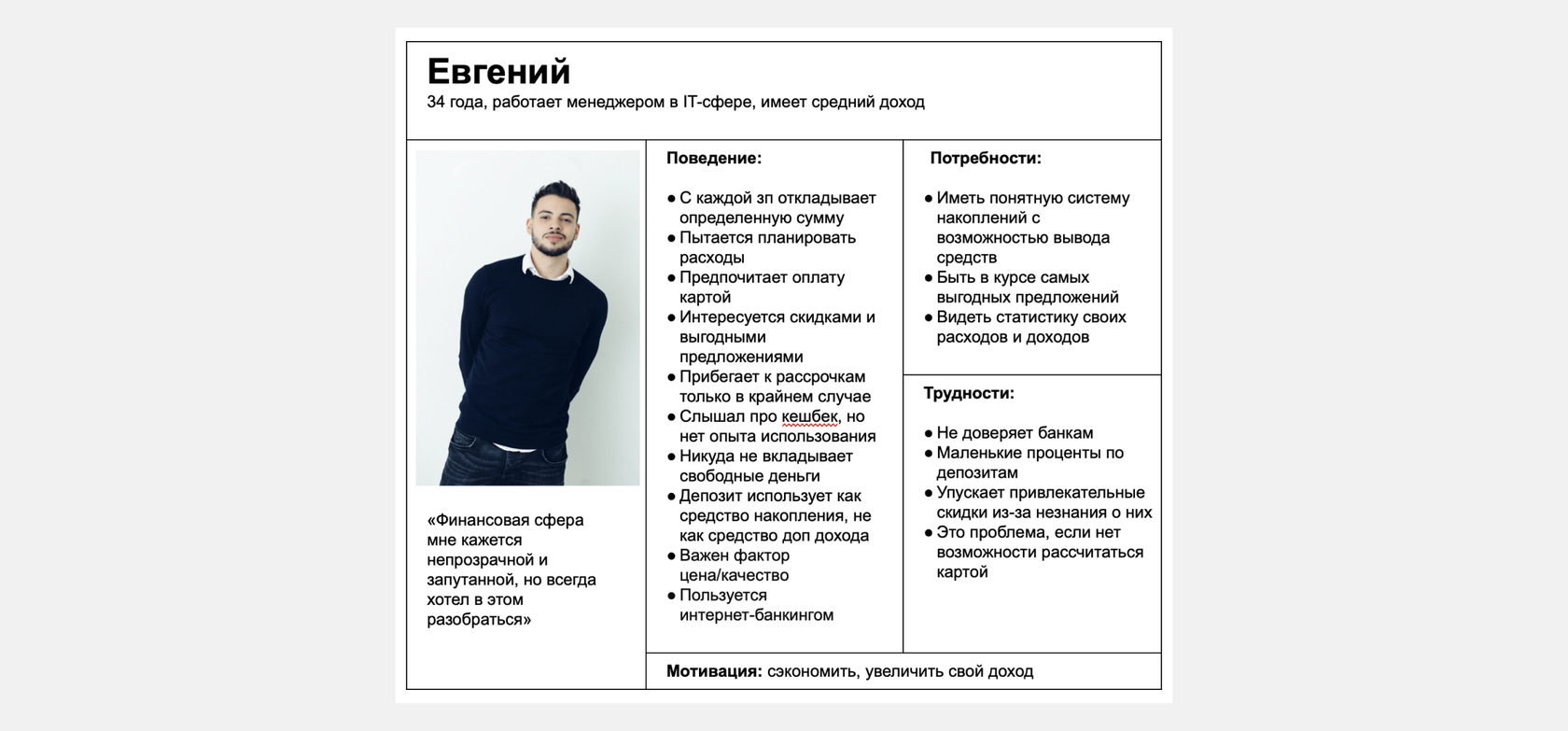
As a final research artifact, I created a user persona representing the most common users’ behavior, needs, challenges, and motivation patterns.
September-October / 2018
Product Designer
UX Consultant
Design Mentor & Speaker

Based in London, I’m a designer with over 15 years of experience in user-centered design for web, mobile, and smartwatches. Beyond product work, I explore game development and interactive concepts, share experimental ideas on Dribbble, and actively mentor designers and speak at events to help others grow in the field.
For the past six years at Flo Health, I’ve led gamification and wearable initiatives, including sleep and body temperature tracking, and developed features such as the symptom checker, logging, and other core user experiences.
Formerly at Fitbit, I worked on the Health Solutions team, designing corporate wellness systems, wellness dashboards, B2B2C mobile activity challenges, telehealth services, and smartwatch applications.
Alongside my product work, I’ve been deeply involved in design education, teaching and mentoring hundreds of students since 2018. I’ve developed and led learning programs focused on UX/UI, product design, and creative problem-solving, helping aspiring designers grow both their skills and confidence.
I’m a product designer skilled in UX/UI design, design systems, prototyping, and visual design, with experience in information architecture and microinteractions. My approach blends user research, data-informed thinking, and accessibility to craft designs that drive growth and usability. I enjoy collaborating across teams, mentoring others, and facilitating workshops to align ideas and outcomes. Proficient in Figma, Protopie, Photoshop, After Effects, and Blender, I also work with HTML, CSS, C#, and AI-driven design tools. Additionally, I explore 3D and motion graphics, gaming UI, illustration, and brand design to bring creative depth to my work.
Activity &
mentions